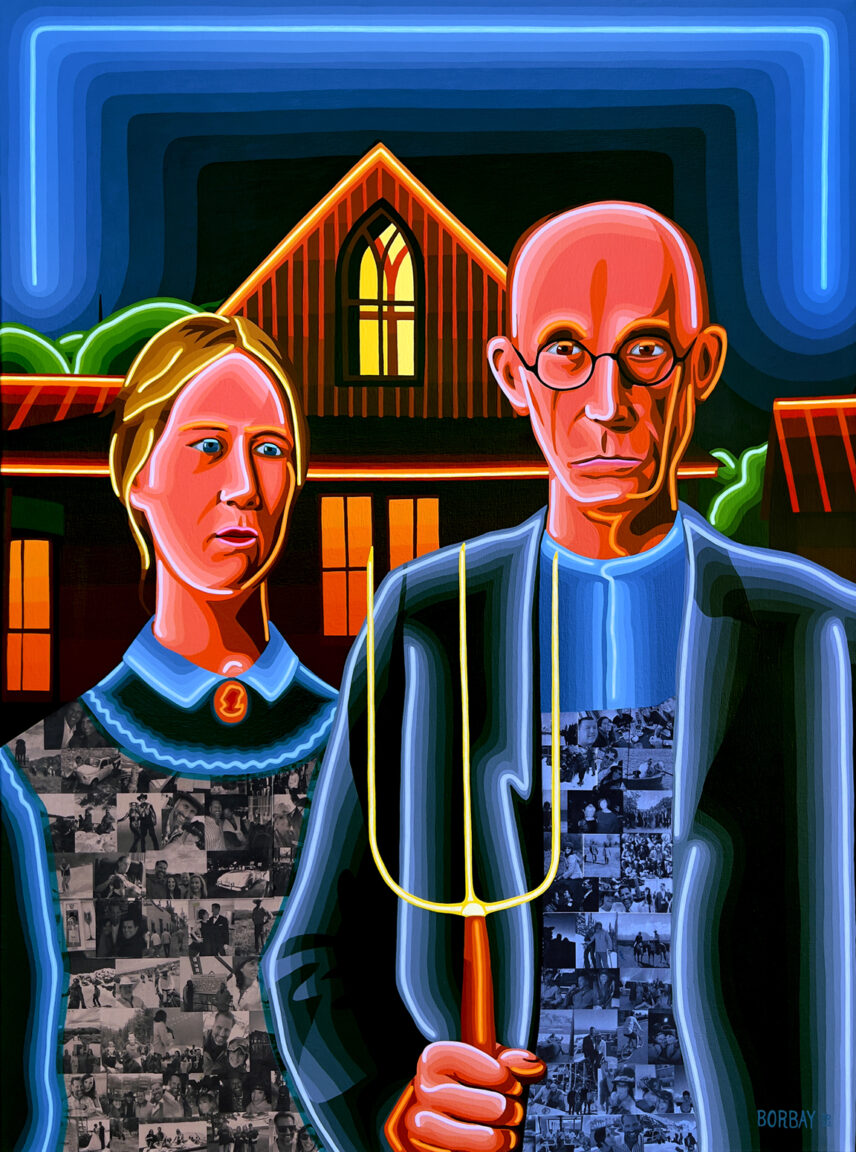
Back in my NYC advertising days, I met a talented creative director by the name of David. We stayed in touch when I moved out West… and, in following my career, he was kind enough to introduce me to his good Jackson Hole-based friends — the Faupel’s.
Matt, Julie and yours truly struck-up a conversation… and decided to collaborate on a commission. We wanted something that embraced classic Americana, but with a contemporary touch. So, what better to create than a neon version of Grant Wood’s “American Gothic”?
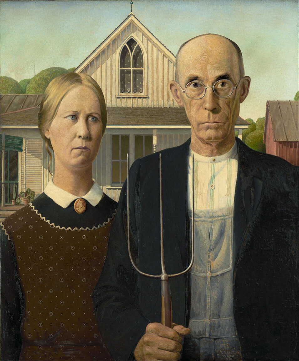
This is the original painting by Mr. Wood. The woman is artist’s sister — Nan Wood Graham. The gentleman holding the pitchfork is his dentist — Dr. B. H. McKeeby. I’m pleased to report I have a fantastic dentist in my hometown these days (thank you Dr. Marshall)… but for years, I had a crippling fear of those tasked with cleaning my pearly off-whites. So… I can relate to the concept of dentist as a menacing figure.
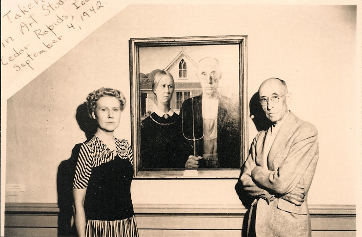
And here is a 1942 version of “meta”, with the subjects standing in front of the painting. Is it just me, or does Mr. McKeeby seem even scarier beyond the frame? I digress.
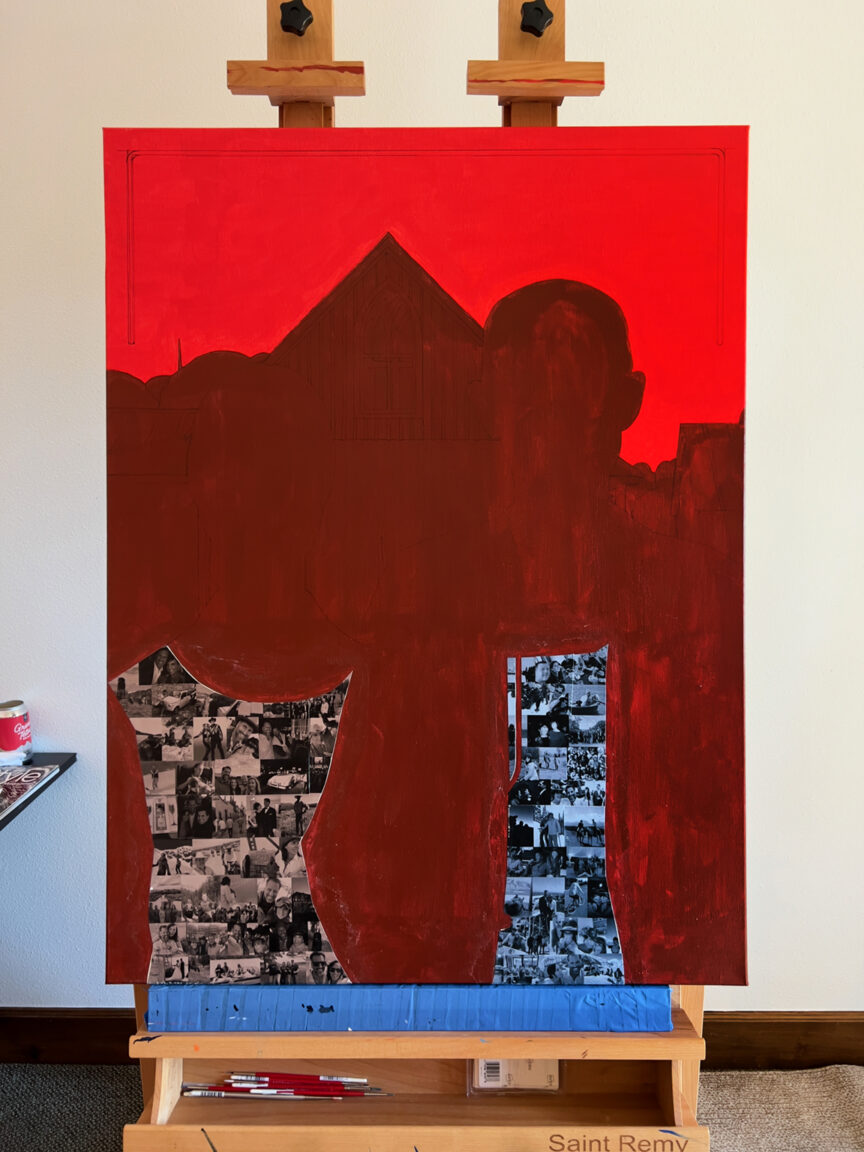
The piece began, as always, or I should say… as most often… with a warm underpainting. After carefully curating the images, they were collaged to the canvas.
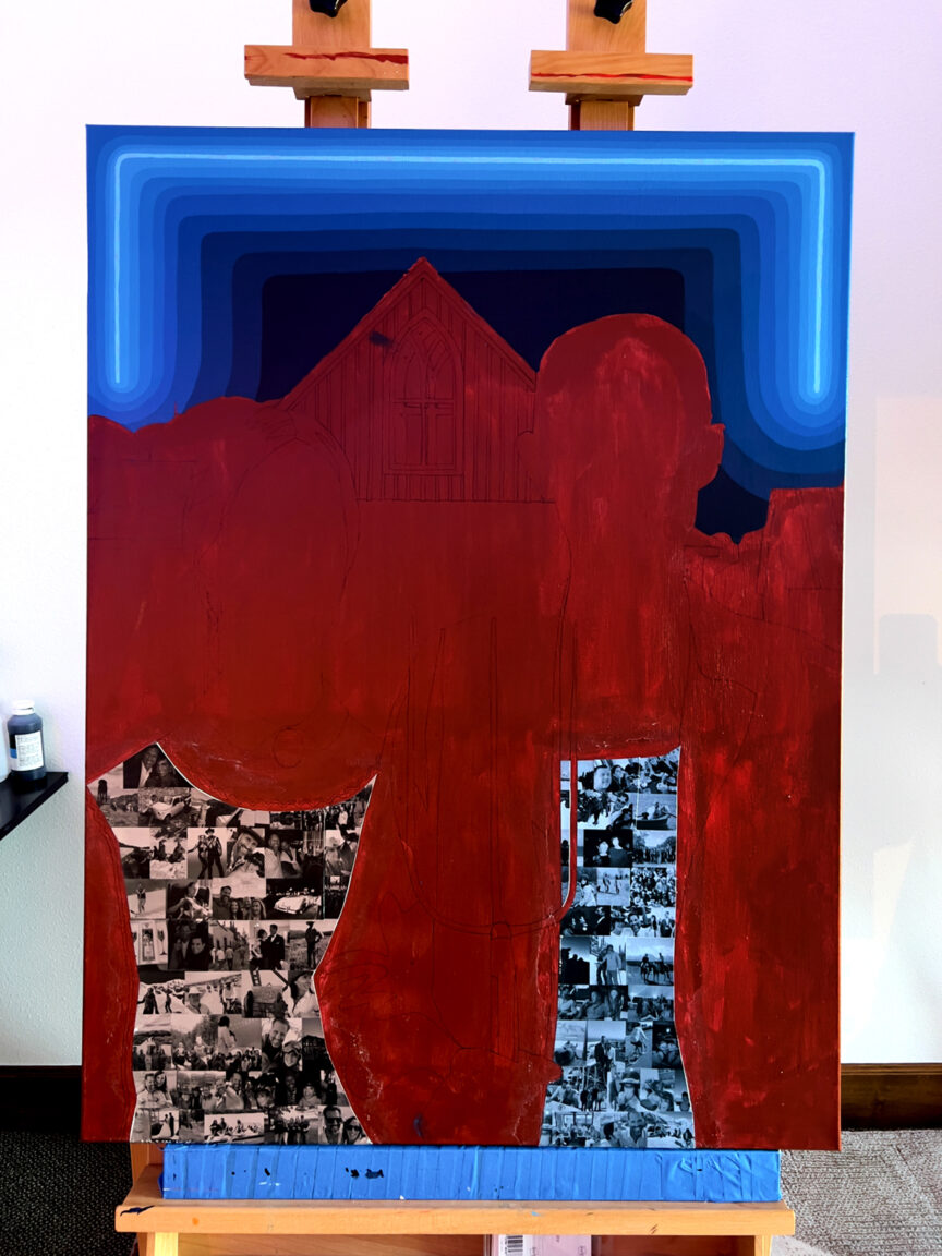
The sky is always an anchor for me… so it’s no surprise to see it early in the process. As they layers of blue/green amassed… I was busy drawing the details throughout.
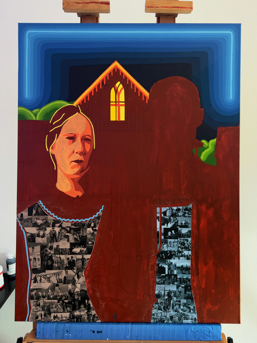
When re-inventing, or inventing, a painting… it’s helpful to layout the general colors to establish a feel. I wasn’t sure how the faces would come together, so I treated them as a normal portrait to nail down the likeness.
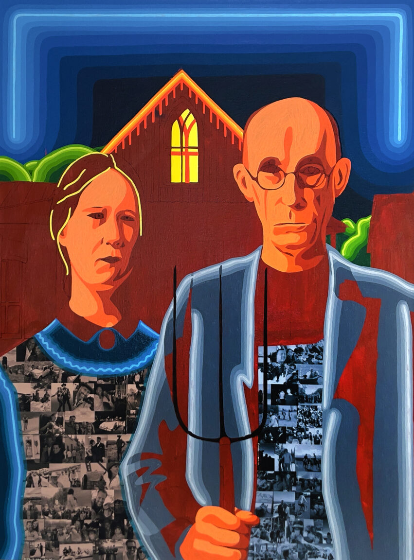
That was absolutely critical… it helped me understand the balance throughout… and I spent much of the process imagining where the tubes might go.
Over the years, I’ve become fond of working 5-6 palettes simultaneously. This way, you can layer different areas of the canvas, and avoid “wait for it to dry” time victimization.
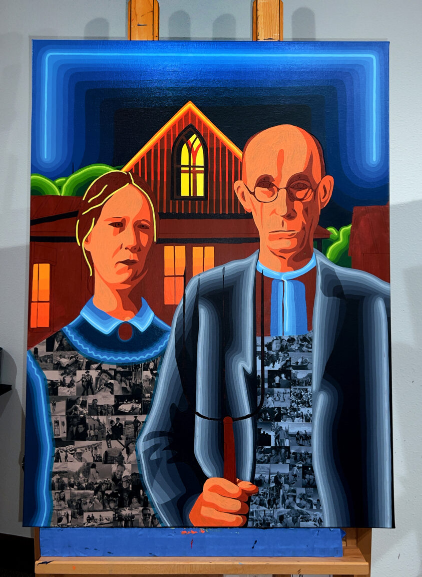
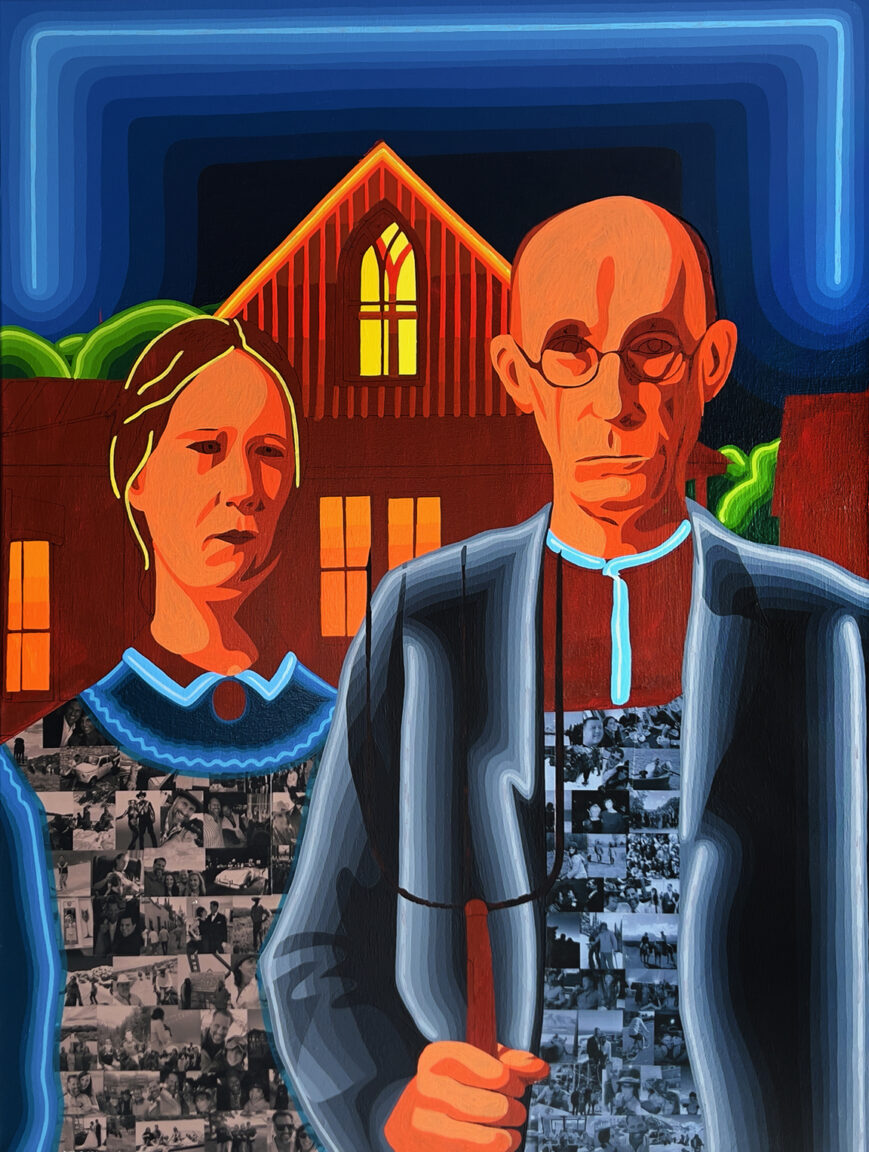
For the windows… I wanted to capture the warm light of a farmhouse interior… to balance with the blues visually. Nothing compliments like a complement.
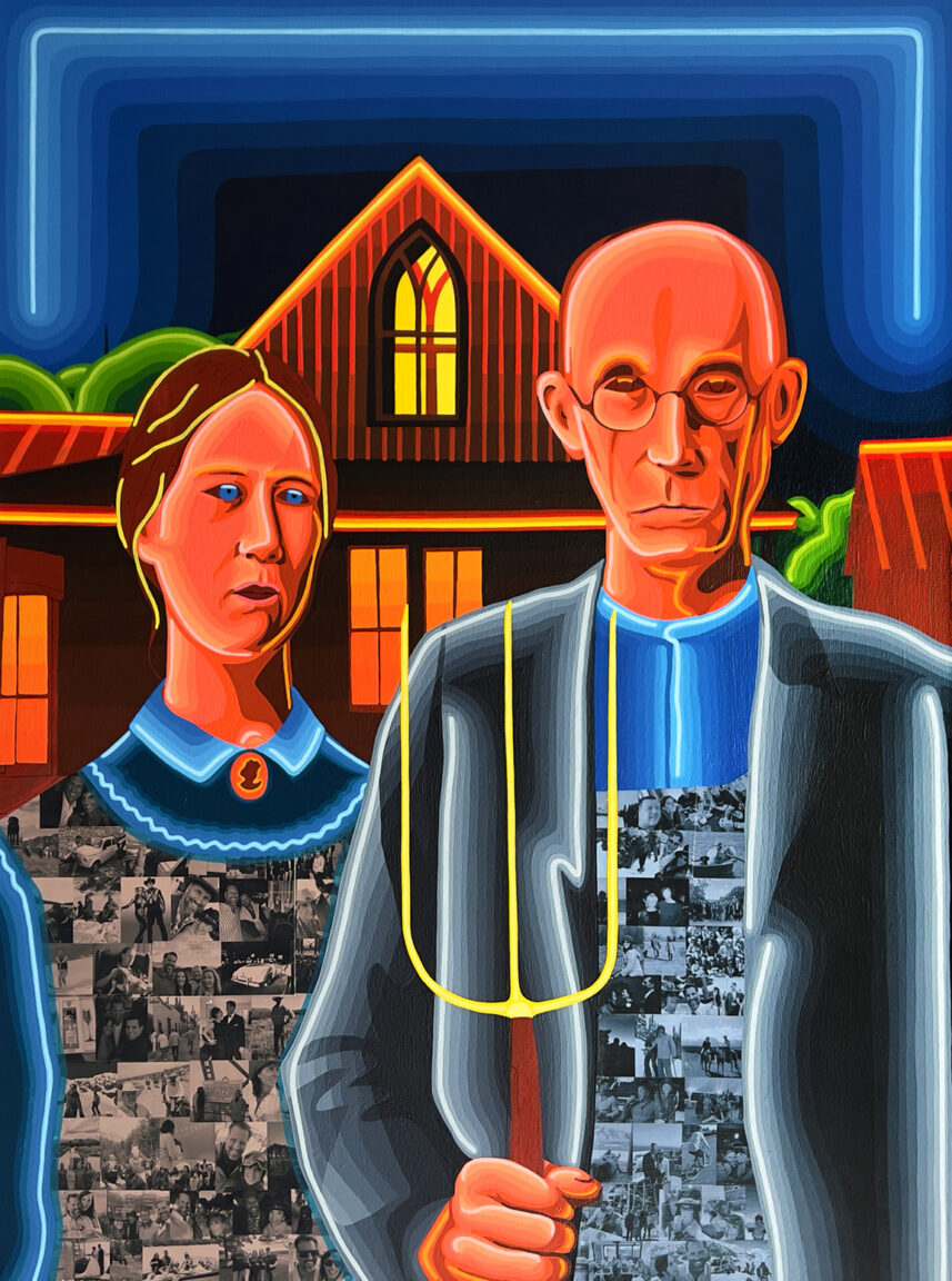
When I get to this phase of a painting, I can officially “smell” the finish… so a final checklist is created, and I prepare my final palettes. They say eyes are the window to the soul… without eyes, a figure does feel menacingly devoid.

And with the final touches places… I’m delighted to share “American Gothic Neon.” I’ll never forget the first time I saw this piece in a text book circa 1992. It felt interesting, harmless and menacing in concert.
Having an opportunity to add my vision to Grant Wood’s timeless piece was incredible — Julie and Matt, I thank you for this commission. It was incredible working with you, and I can’t wait until that bad boy is in your beautiful home. Here’s hoping you love it forever.
David, thank you again for this fantastic introduction. As it turns out, Matt and I played in the same hockey beer league in Jackson for years. Standing a foot taller than yours truly, I’ll let you guess who had the upper hand on the ice.
If you’d like to learn more about this painting and its mesmerizing lore… do view this video.
