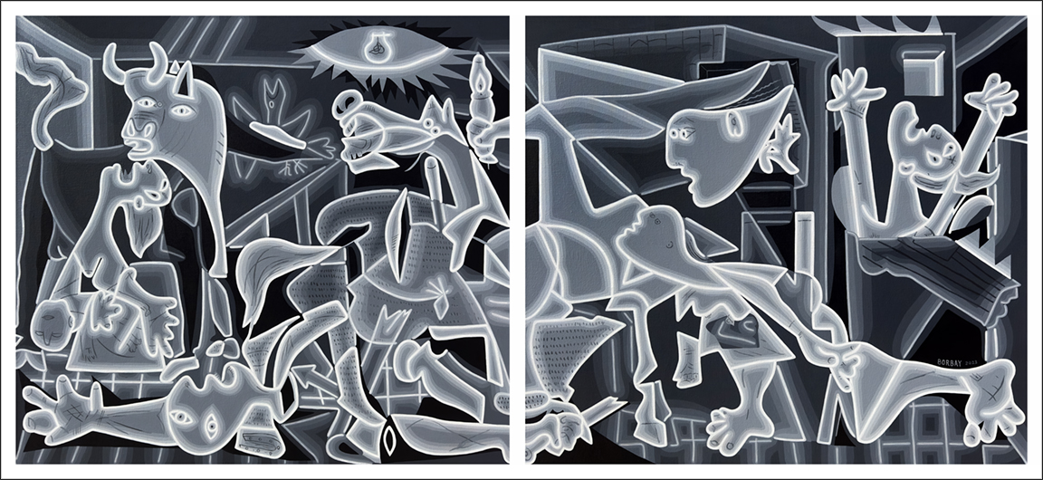
Continuing my Re-Mastered series… which began with “American Gothic” — then took flight with “Mona Lisa” — please allow me to introduce — “Neon Guernica”.
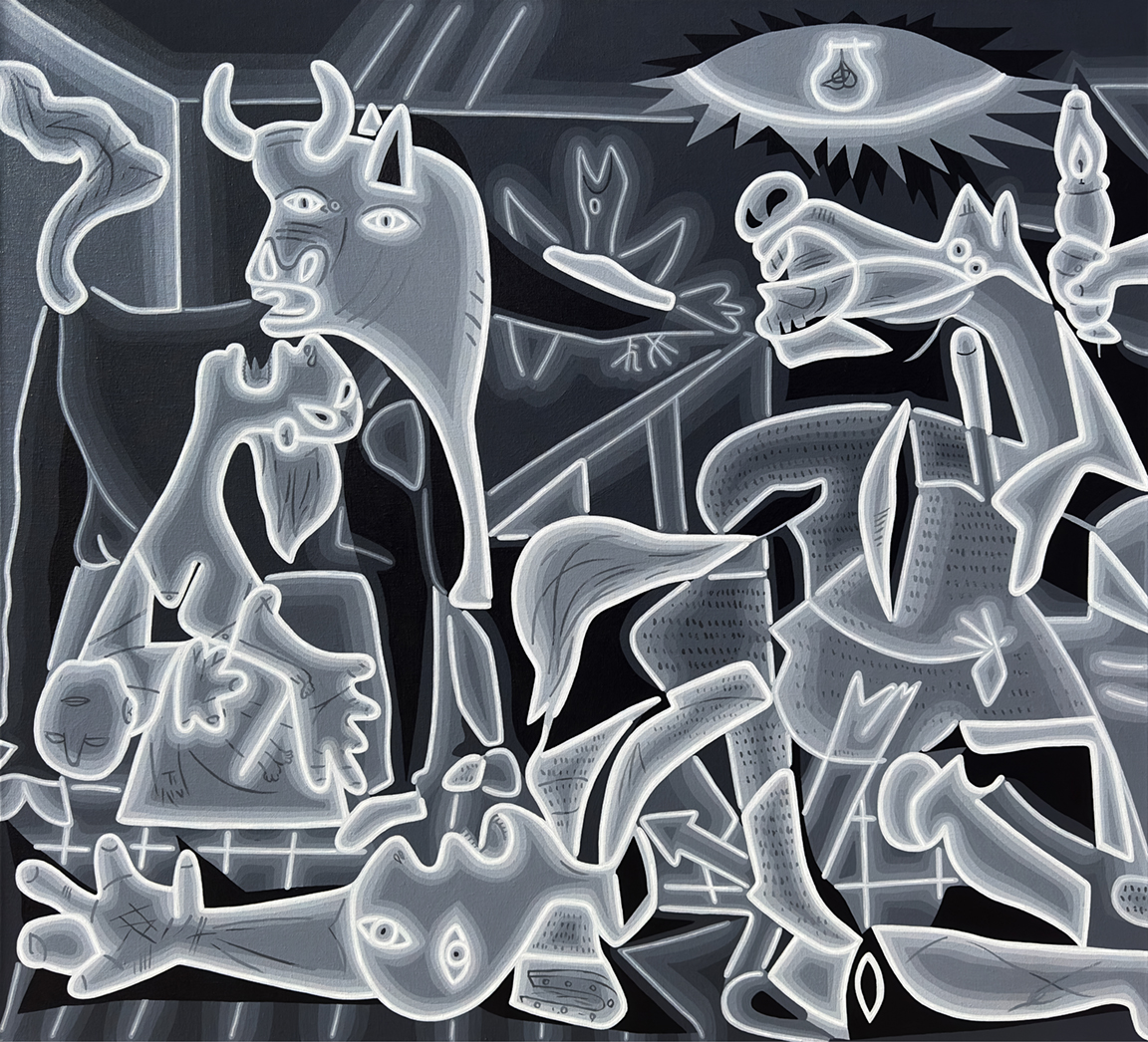
Picasso’s master work measures 11 by 29 feet — which is significantly larger than my two, 36″X40″ panel, neon iteration. Here is a closer look at the left side.
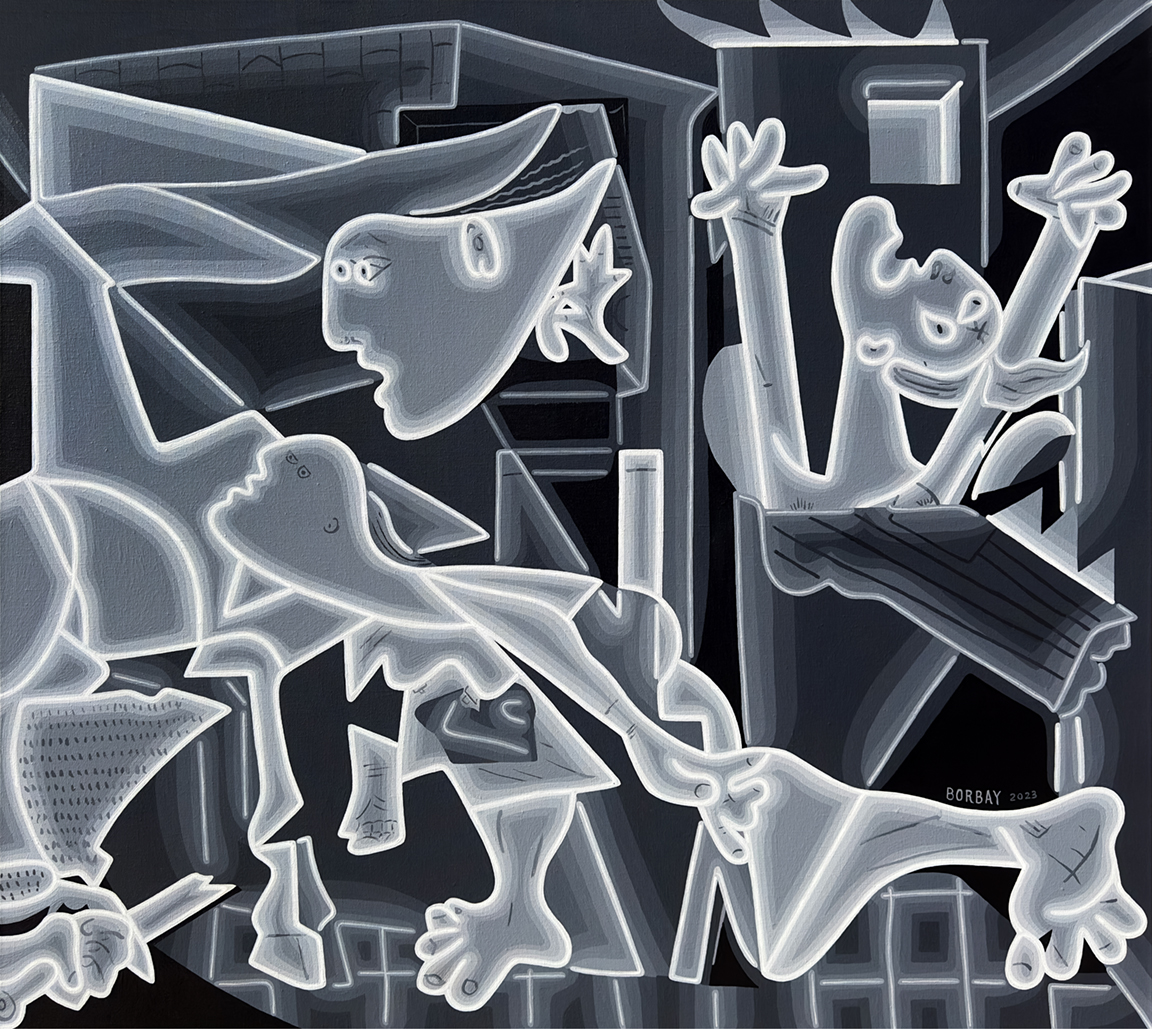
And now the right. Without further adieu, let’s dive into the history of Picasso’s Guernica, why I chose to paint a neon version — and the recent good news for art lovers visiting the The Reina Sofía Museum.
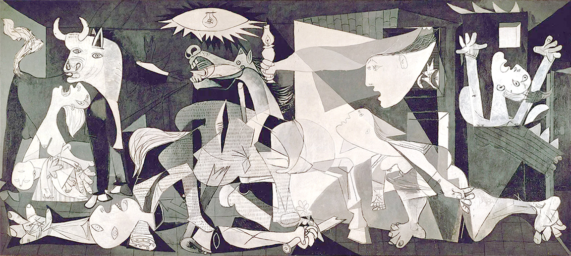
When Picasso debuted Guernica, the reception was cold. “Created in 1937 at the height of the Spanish Civil War, it has in the 85 years since become a universal statement about human suffering in the face of political violence.”
Over time, despite the poignant imagery and public outrage — this work has become an enduring masterpiece. It is, indeed, a challenging, risqué image to recreate. Of course, the artist’s who have taken on Guernica are legion — notably, Ron English, who has done 50+ iterations.
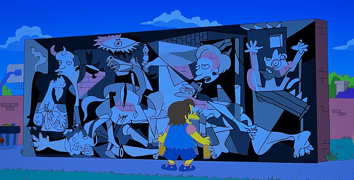
Guernica has been re-imagined by The Simpsons. It was also defaced by artist and famous gallerist — Tony Shafrazi. This all begs the question — what is the line between appropriation, homage and theft?
Picasso spent the later part of his career recreating master works in his visual language. He was also famous for saying, “good artist’s copy, great artist’s steal.”
This doesn’t apply to direct theft… rather, he was famous for identifying new modalities, and making them his own. When Georges Braque was inventing Cubism, Picasso jumped on board and essentially claimed the new style as his own. This was his message. And so, if anyone would understand my neon Guernica — it would be Picasso.
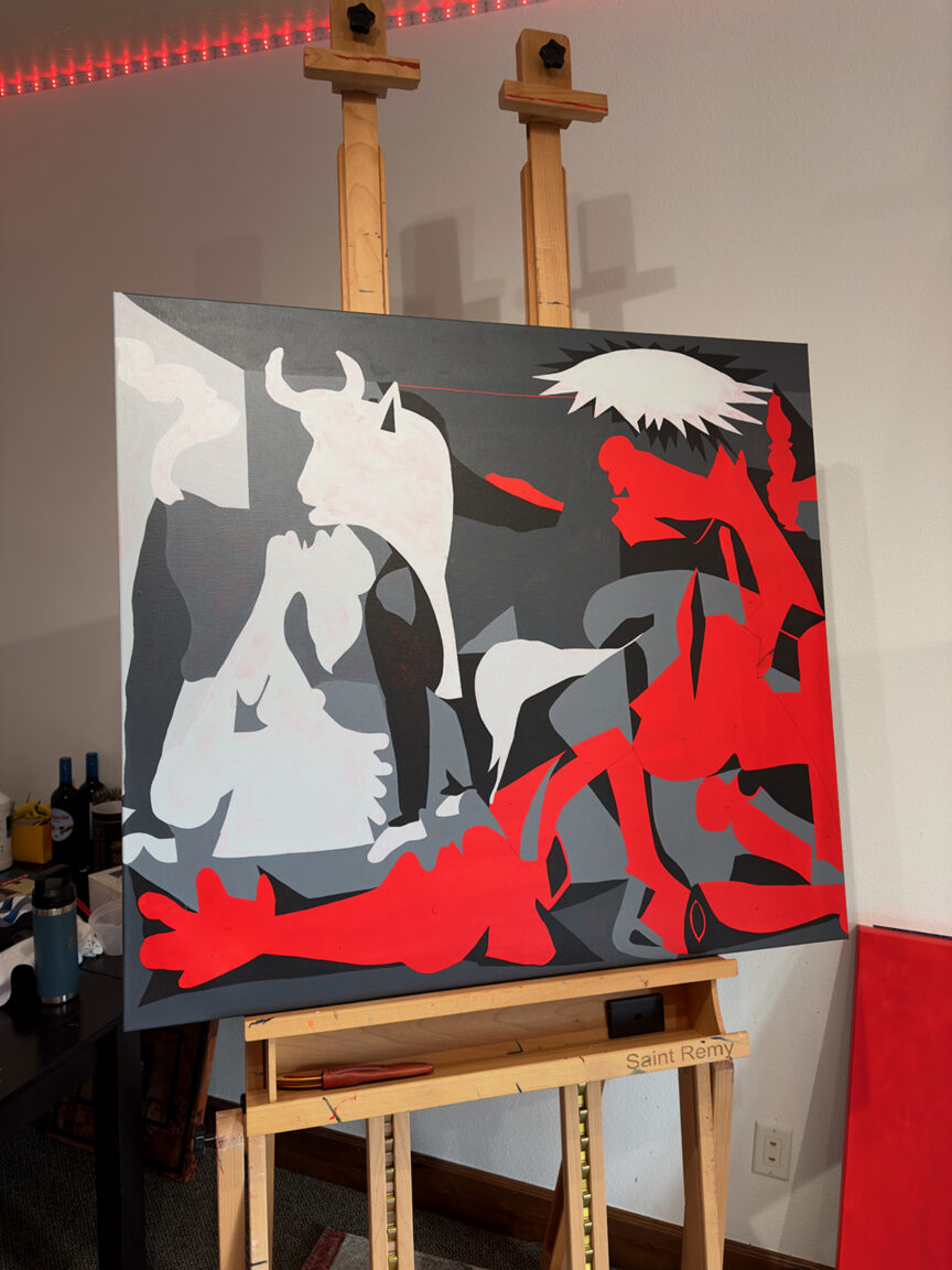
Anything deemed “transformative” demarcates something new. What is transformative? It’s loosely defined as, “take something, do something to it, do something else to it.” Provided you hit this three point criteria, you are protected. Throw in the First Amendment, and copyright’s 100-year life span.. and virtually everything is free and clear. And so, my Guernica began with a red underpainting, and the creation of the general shapes.
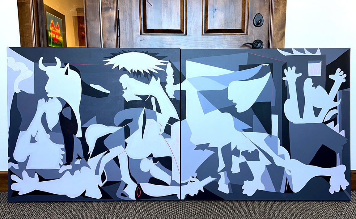
From there, I quickly went to work, blocking out the essential shades and shapes. The composition is anchored by a slightly off-center triangle. This visual device dictates how the viewer interacts with the picture plane.
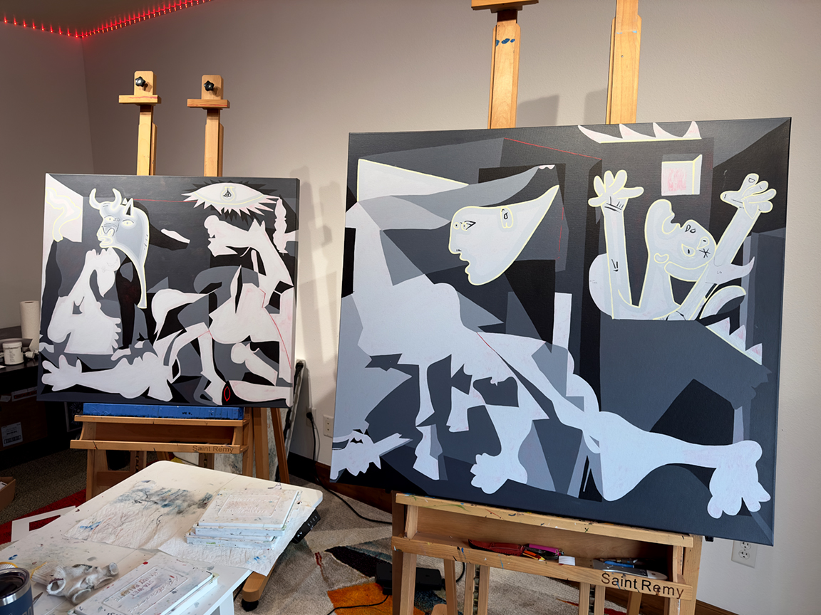
Next, it was important to establish where the neon would exist. I began with a light yellow set of lines to help differentiate the tubes from the shapes. While I did establish some essential lines in addition to the tubes, the neon guided the early process.
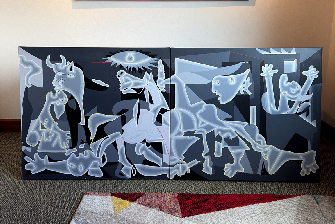
From there, I began whiting out the tubes for the first set of neons.
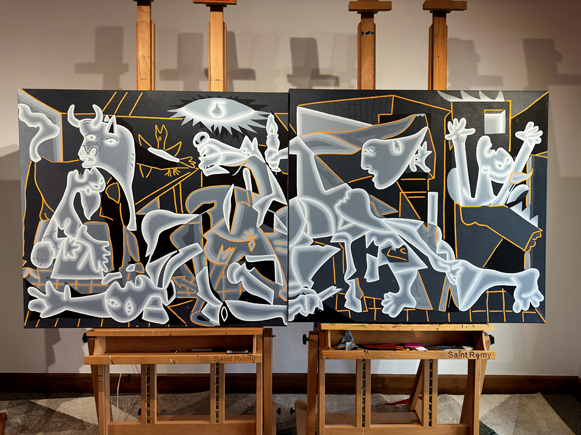
With the brightest tubes established, I turned to a light orange to establish the rest. There are a great deal of subtleties within Picasso’s masterwork — so I decided to emphasize many of them with neon. There were, as always, folks who loved the orange… and while I agree, it did deliver a satisfying effect — it was important to honor the original monochromatic result.

All that remained was to polish and pop the tubes, and add some of the line work seen in the original. This combination of Titanium White and Mars Black never fails to deliver a polished, silver look-and-feel — which is why they are my go-to for black-and-white works.
It has been a tremendous, educational journey creating Neon Guernica — and I’m proud to have it on display at Borbay Studios & Gallery. While I have two other paintings on the easel, I will continue this series… who knows? Perhaps I begin my next Re-Mastered painting on a Starry Night…
