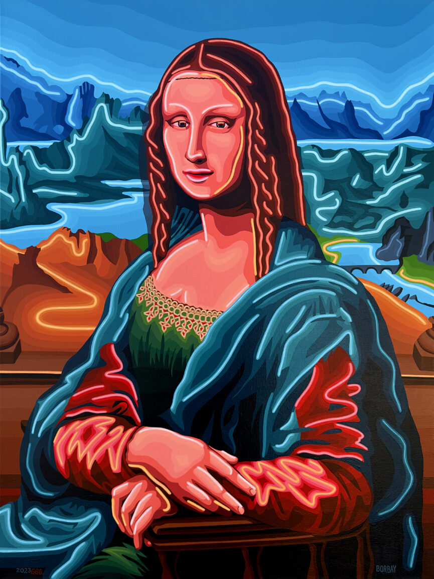
A recent commission of Grant Wood’s ‘American Gothic‘ inspired a new series… “Re-Mastered” — a fresh look at historic masterpieces. And so, I decided to bring a slice of the Louvre to Borbay Studios & Gallery… with ‘Neon Mona Lisa’.
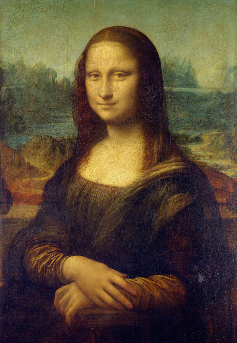
Leonardo da Vinci’s Mona Lisa is world famous. Yes… it’s timeless. Yes… it was created by a prolific artist and inventor, who went on to become a Ninja Turtle. But why is the Mona Lisa so important?
On the morning of August 21, 1911 — the Mona Lisa was stolen. Owing these sticky fingers (and the proliferation of global news) a thanks, Mona became an international sensation over night. We all think the Kardashians re-invented the game… but we have Mona to thank for influencers.
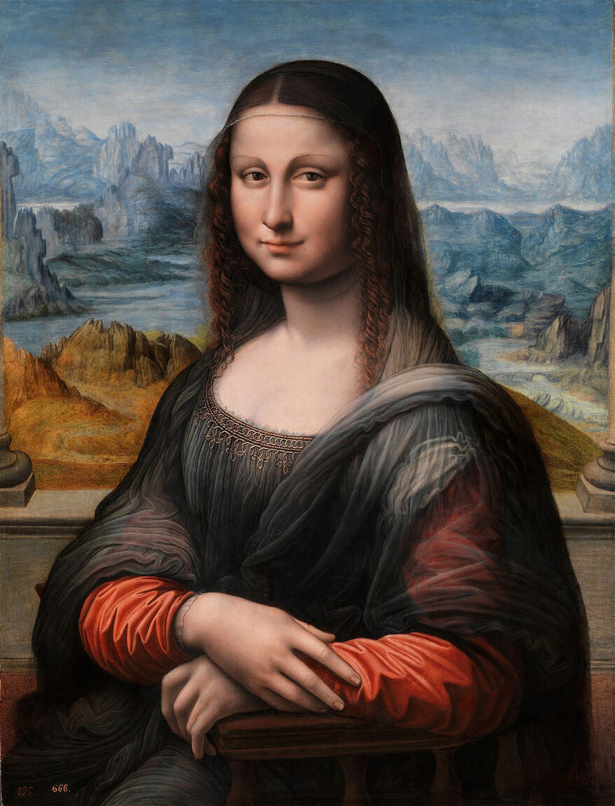
Ironically, it wasn’t da Vinci’s Mona I used as a source image. Rather, I zeroed in on “Mona Lisa del Prado“… which, itself, has a colorful history… or maybe not so colorful. The work was on display for years with a completely black background. Eventually, through advanced imaging, they discovered the detailed background — and stripped the darkness for light. This version afforded me greater detail, which I brought to the neon version. And where precisely is the background located? According to a 2011 study, Montefeltro in the Marche, Italy.
Oh, and you’ll notice a curious number in the viewer’s lower left section of the canvas — “666”. Was it simply a catalog number? I have my thoughts on the subject…
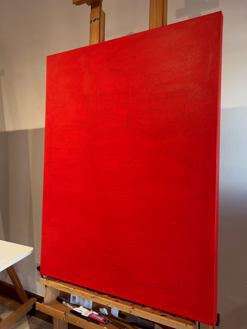
A creature of habit, this piece began with the standard warm under-painting, followed by the painstaking drawing process.
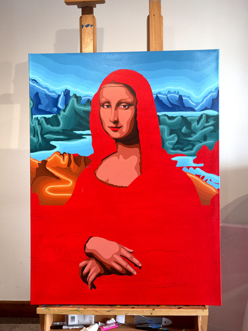
Typically, I like to work the entire canvas at the same time. However, when exploring a well-known image in a new style, I eschewed my standard approach and focused on developing the piece top-to-bottom. I know our high school figure drawing professor, Jeff, was probably shaking his fist at me vigorously from above… but, I chased my procedural conviction on this piece.
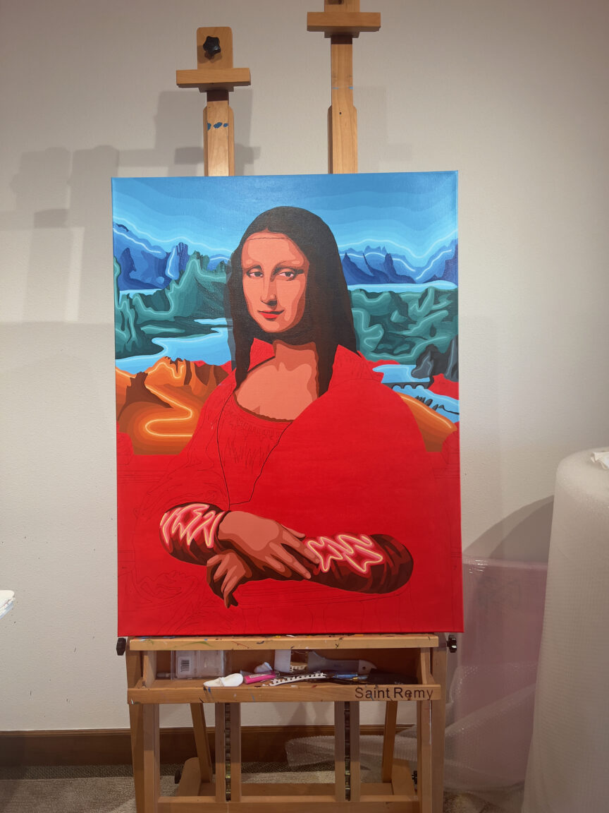
As it happens, the original tonality I chose for Mona was incorrect. This didn’t bother me, of course, as I still had to add the tubes, which would alter the complexion. I dove into the fore-arms here, as her red outfit was covered by a translucent shawl on her upper arms.
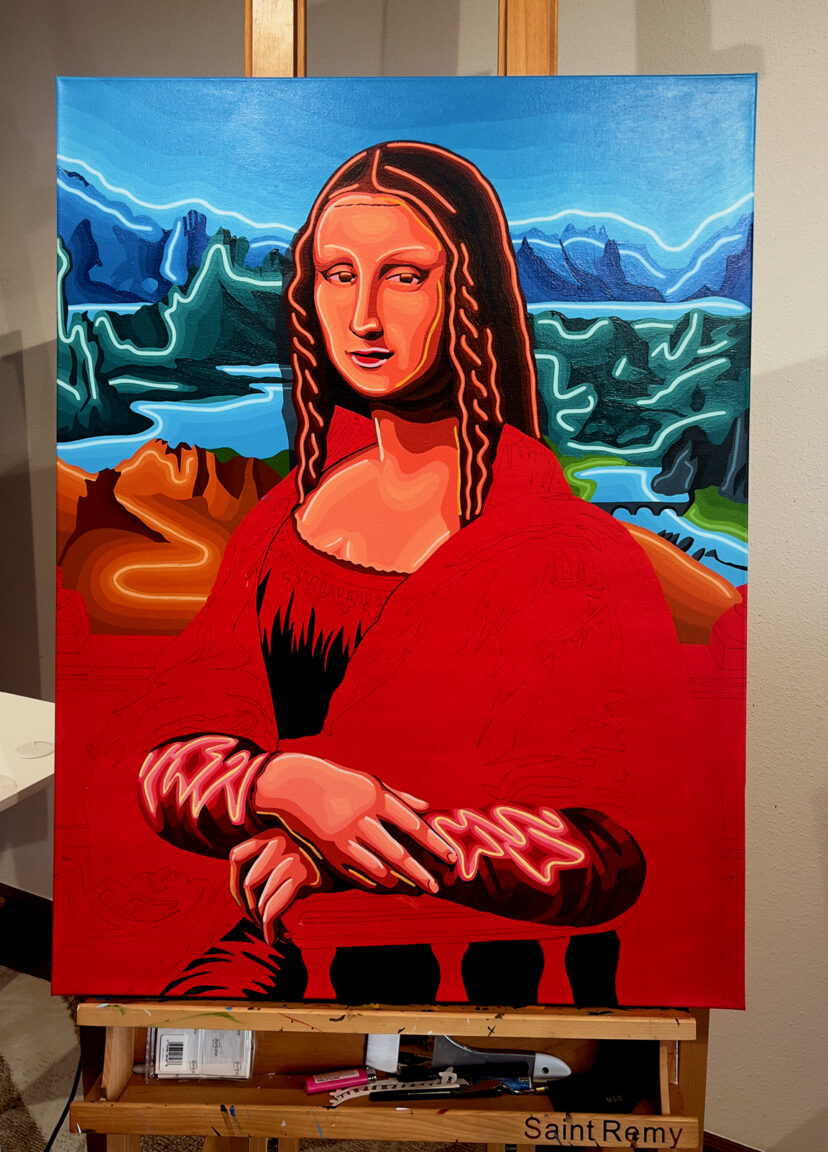
Ah yes… the tubes. So important. When adding neon to a figure, it’s extremely challenging to strike an appropriate balance. As with American Gothic, I went with two tube colors… lighter for the highlights, and orange for the shadows. The background felt settled and balanced, so it was time to articulate the rest of the picture.
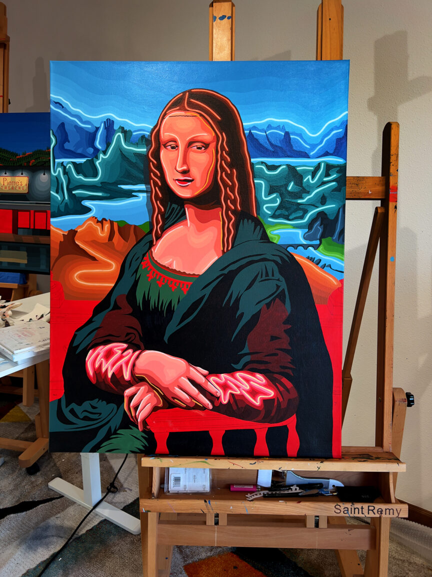
Laying out the shawl and outfit was grounding. Bringing it all together, I had to now decide where to add tubes… and, of course, how to address the balustrades… another clarity provided by the Prado Mona.
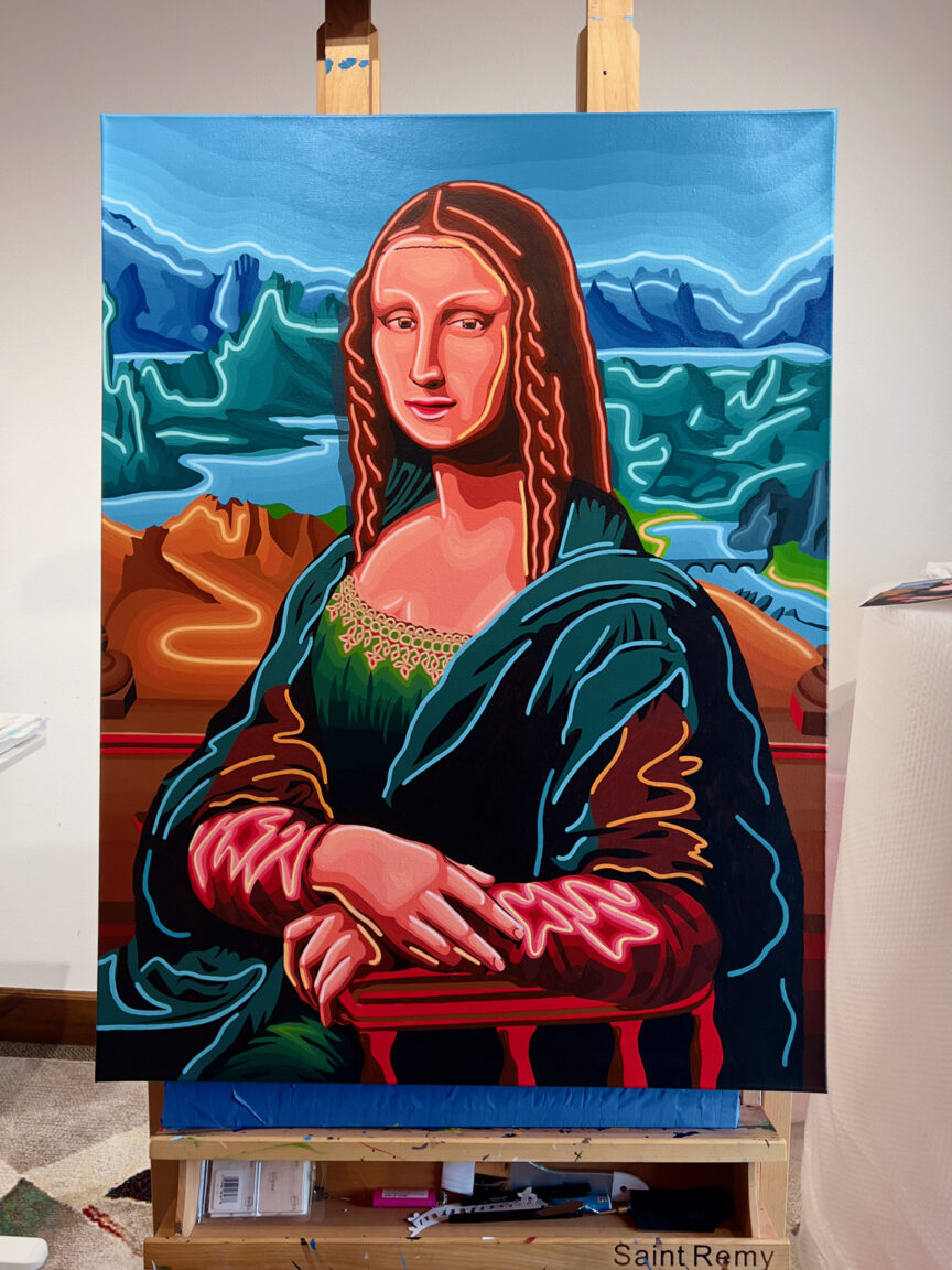
There are moments in a painting that feel extremely satisfying… this was one such moment. With the remaining tubes nailed down, I began to smell the finish. That smell, by the way, is akin to the nose of a fine Brunello di Montalcino… it brings peace, anticipation and excitement.

And with a final pass, the Neon Mona Lisa was signed. Revisiting these master works has been incredible on many levels. Another reason the Mona Lisa is so famous? The composition is exquisitely balanced… you cannot find a deactivated slice of imagery anywhere on the surface. The colors are rich… and, of course, that look. What does it mean?
Well, that’s between Madam Lisa Giocondo, Leonardo and his patron — a wealthy Florentine. While Neon Mona wasn’t a commission, she quickly found a new home — and for that, I’m eternally grateful.
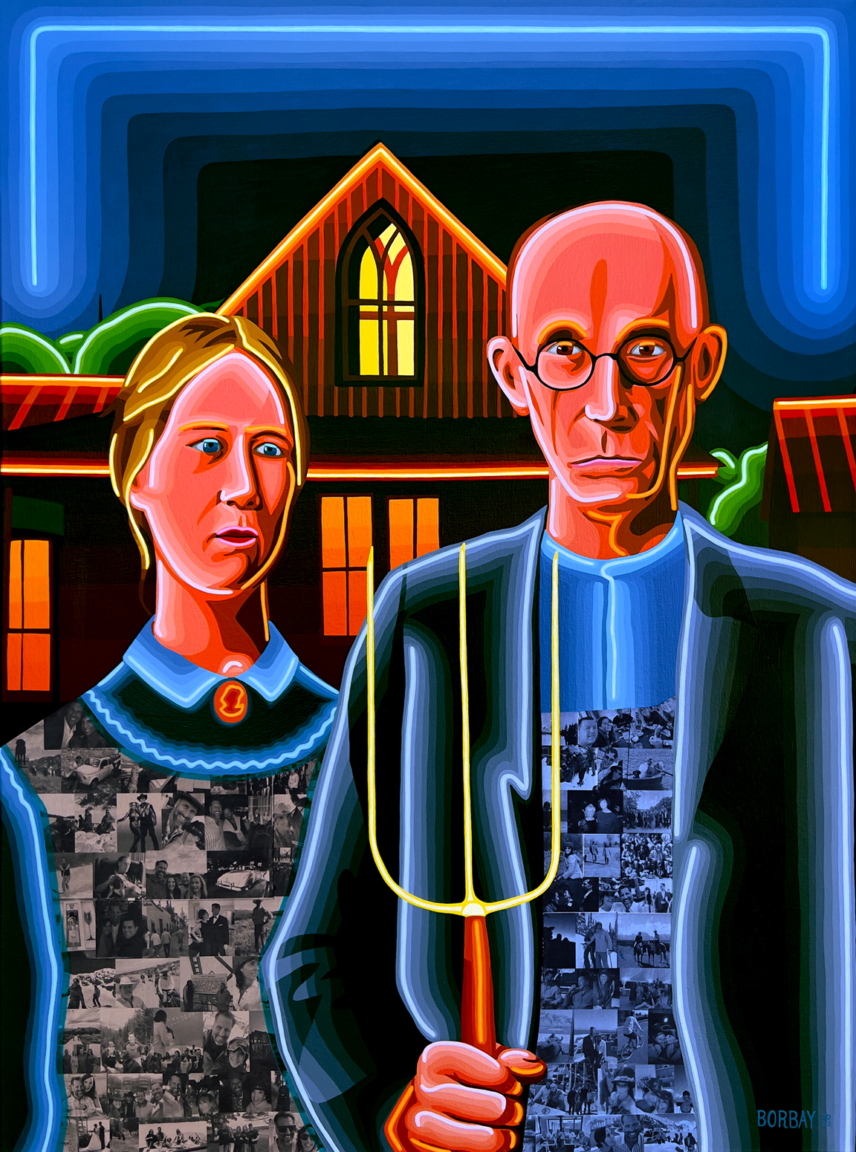
Mona joins Neon American Gothic. Next? I’ll be re-mastering Picasso’s “Guernica” on two 36″X40″ panels. After that… which masterpieces would you like to see re-mastered?
