“Get The Picture” by Bianca Bosker is a fascinating art world exposé. The ART WORLD? Gigantic and infinitesimal. The center? Manhattan. My home of 13 years. Despite being full-time since July 2, 2009 — a self-represented artist based in Idaho is an extreme art world outsider.
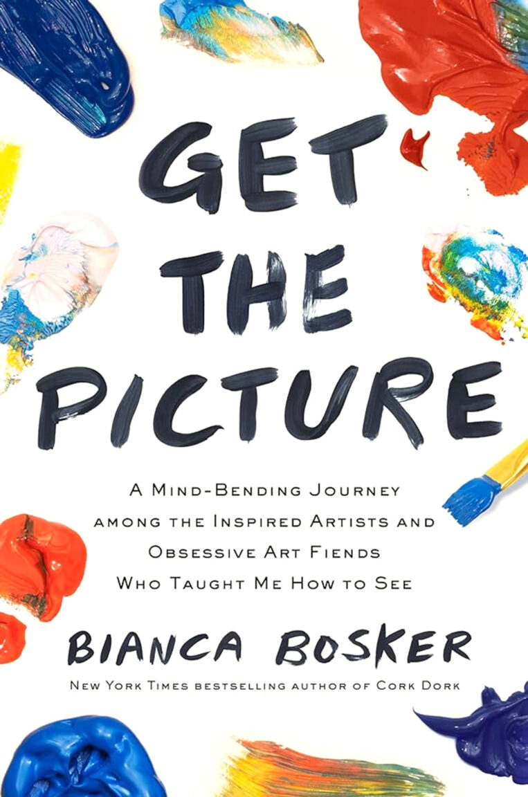
Accordingly, the following had me spitting coffee:
“…at certain Brooklyn openings, you could reliably revive a stalled-out conversation by shitting on Gagosian, capitalism, or painting, all of which were roughly synonymous.”
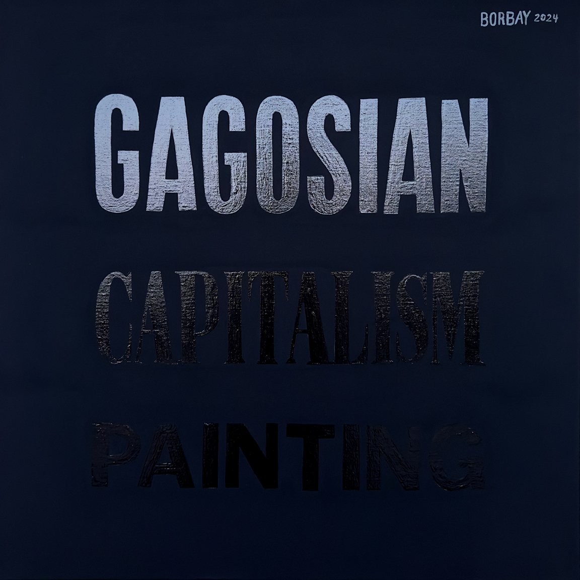
Gold, Jerry. Gold! Right there and then, “Roughly Synonymous” was born.
“Get The Picture” explores developing an eye… to see beyond the work. Meaning, context, experience… the intangibles.
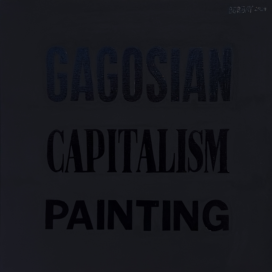
Accordingly, light and proximity to “Roughly Synonymous” morphs the experience from pure black, to a virtual neon in two paces.
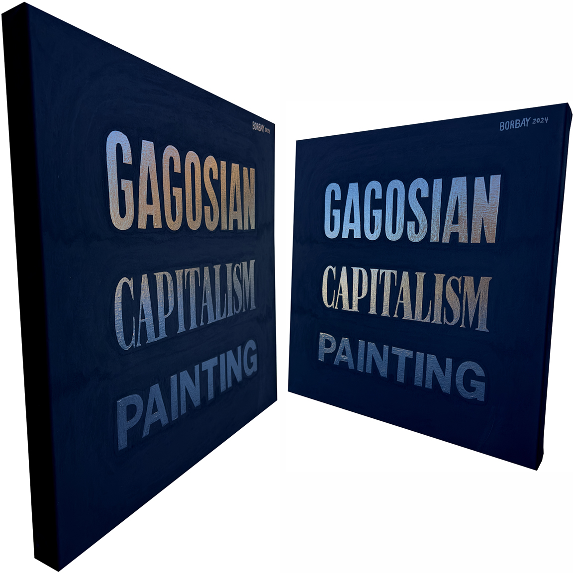
“Roughly Synonymous” is 24″X24″X1.75″, Acrylic and Rust-Oleum on Belgian Linen.
The only thing more challenging than painting with Rust-Oleum, is photographing a work with Rust-Oleum. Now that you have the how and why, let’s explore the context.
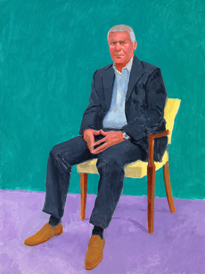
GAGOSIAN — Larry Gagosian is to the art world what Tom Brady is to the NFL. He didn’t invent the game… but is the best to play it.
Gagosian’s museum calibre galleries generate over 1 Billion in sales per annum. A tidy sum. Before he was a titan, Gagosian got his start selling posters near UCLA. Everyone loves a humble, hard-working poster slinger. Consider the inception of Starbucks — a single shingle in Seattle. Two new locations? The American Dream in action! But, then… success turns. A Starbucks on every corner shifts perception from scrappy upstart to evil empire.
So too, did Gagosian’s success cast him as the art world’s villain. They love you until they don’t. And so, the first word in “Roughly Synonymous” is Gagosian’s logo.
CAPITALISM — For some curious reason — fine artist’s are held to ridiculous standards. Creation is sacrosanct. Consumerism is crass. Capitalism makes the c-word sound melifluous.
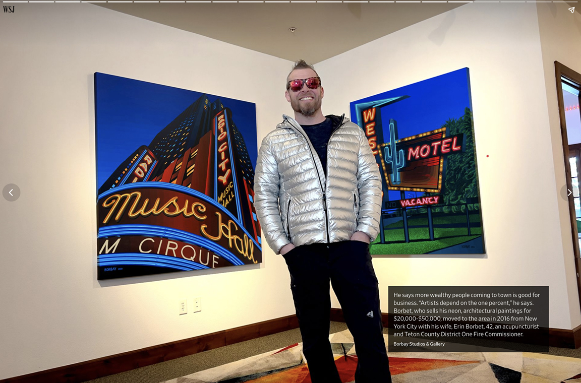
Accordingly, I decided to paint “CAPITALISM” in the Wall Street Journal font. When my name appeared in the Journal on October 5, 2023 — the response was overwhelmingly positive. Still, a spectrum of critics descended mount sanctimonious to cast shame.
Toiling quietly at Borbay Studios & Gallery in Victor, Idaho? Excellent. Sharing an opinion on a ski resort with my art prices? Shut up and paint.
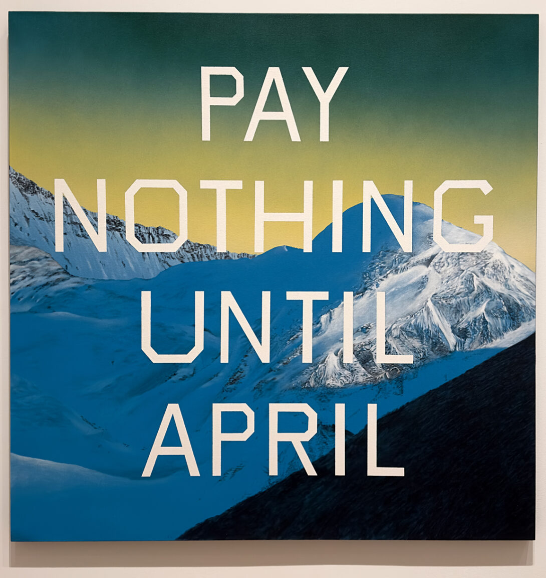
PAINTING — Third in line, “PAINTING” uses The MoMA’s font. Also known as Shangri-La, The MoMA is the Hall of Fame and Fortune for fine artist’s (see Edward Ruscha).
Fittingly, Bosker’s book explores the journey to these hallowed halls. To paraphrase:
- Go to art school.
- Go back to art school, get an MFA (ideally from Yale or Columbia).
- Take $6 an hour job sitting at a gallery desk, be quiet.
- Attend everything, be quiet.
- Pucker up, kiss many asses.
- Get into a group show.
- Get into a small gallery.
- Get poached by bigger gallery (repeat).
- Sell for more, beware of secondary market.
- Get into The MoMA, ascend to art world royalty.
There are twenty additional steps between 9 and 10 — but, you get the picture (ha). Yes… as strange as it sounds… beautifully painted, colorful paintings are considered low brow in high art.
And so… shitting on Gagosian, Capitalism and Painting is considered “Roughly Synonymous”.
Thank you Bianca Bosker for the fabulous read and un-expected inspiration.
