At their root, all signs exist to provide information. Some hope to offer a warm welcome. Great signs do way more, they evoke emotion and often memories.
For those of you in the community of people who had the privilege of spending a summer, or more, at Camp Echo Lake in upstate Warrensburg, NY, there are a series of signs that, when seen in sequence, take each and every one of you from happiness to bliss.
Although I wasn’t an Echo Laker, I’ve met several who are collectors of my work and wow, did that place ever have a lasting impact on them.
Here’s what they tell me: Whether driving from the North or South on the 87, your adrenaline starts flowing as you turn the bend and see the sign for Exit 23, Warrensburg. Moments later, cruising down Main Street you pass Stewart’s and your heart revs up, but not because you’re craving an ice cream.
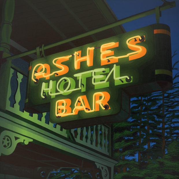
Moments later, you take the left at the fork in the road and as you head up Hudson Street, there she is — Ashes, in brilliant, glowing light. Some of you have been inside, others have just taken pictures with friends out front, almost all have heard the tales, but what’s most important is that you know when you see the Ashes sign, you’re almost there.
Heart thumping, you try your very best to hold your breath the entire length of the cemetery… and finally, you reach the gates… you see the Camp Echo Lake sign… you’re back at your summer home.
Those who passed through the Echo Lake gates in the 60’s, 70’s, 80’s, and early 90’s, had the great fortune to know Morry Stein, the camp’s Owner/Director. Many called him Moe, others called him the Big Guy. All loved him. I wish I knew him.
For those who’ve spent summers at Echo Lake since Morry’s tragic passing in the American Eagle plane crash of 1994, Morry’s presence is still felt in the culture and values each and every day of camp. And for more than 20 years now, his presence has also been felt through the great work of Project Morry, the non-profit founded to realize Morry’s dream and vision that no less than every American child, regardless of economic status, have the invaluable gift of summer camp and year-round support.
Project Morry is transforming lives of children from underserved communities in the New York area – offering social skills, enhanced self-esteem, positive core values and a greater sense of personal responsibility. A remarkable 98% graduate high school and are off-and-running.
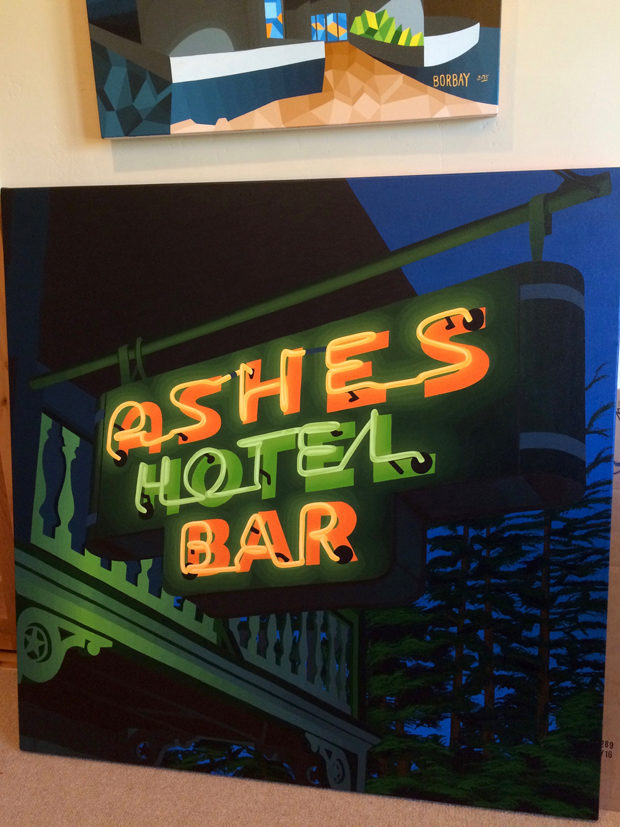
This 48″X48″ Acrylic on Canvas painting of the Ashes electric neon sign celebrates Morry’s gift to children — the unmatched feeling of a warm inner glow that comes from camping. The painting also celebrates Project Morry, which is the living and thriving testament to Morry’s dream and vision. And yes, the neon glows in Green and Gold, the colors of Morry’s beloved Camp Echo Lake.
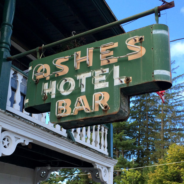
Here is the source image….
If you’d like to see the painting come together in a time lapse video… check this out — music curated by Justin Oringer and mixed in conjunction with OWNECK.
Below, I will take you along my creative journey in a step-by-step, photographic recap.
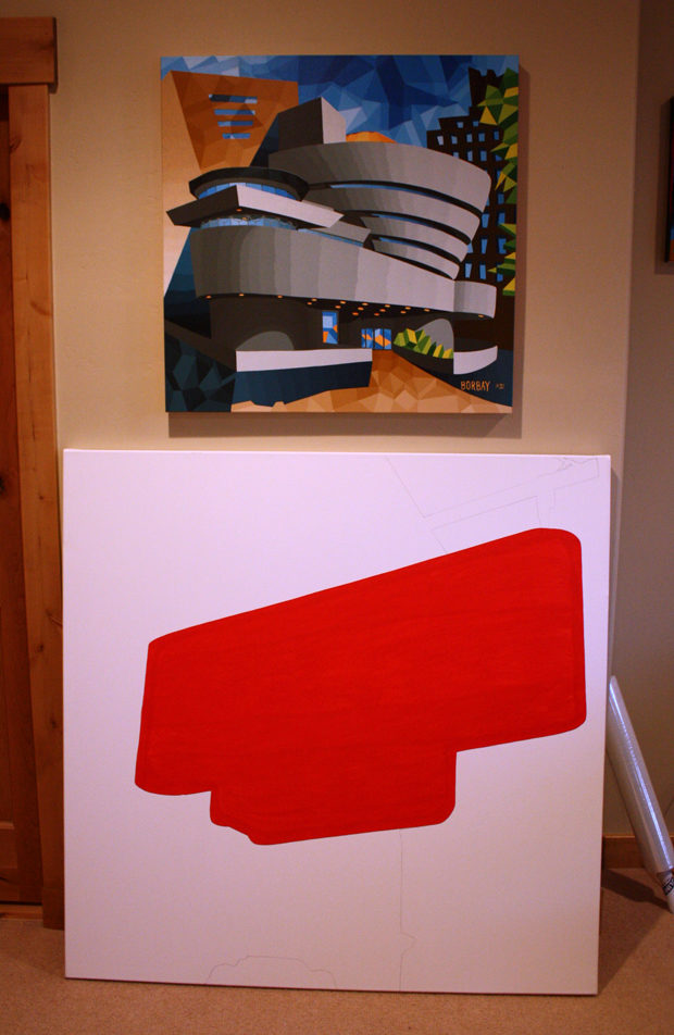
A painting is only as strong as its foundation… particularly when working on a large scale. Ashes began with a basic outline of shapes.
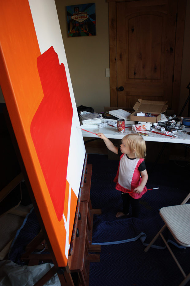
One of my two assistants, Vega, hard at work, helping Daddy complete the warm underpainting.
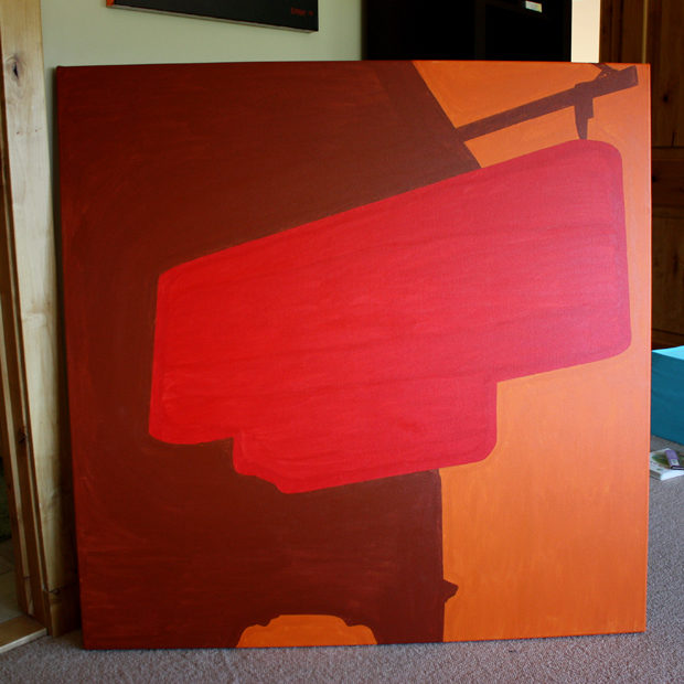
With three basic shapes outlined and identified, it was time to dig in…
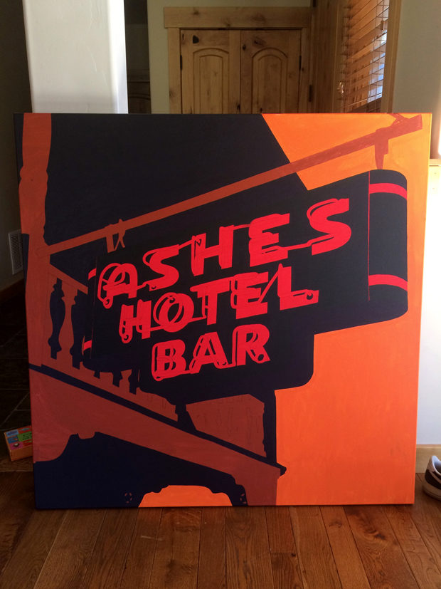
Following a great deal of drawing letters and tubes, the shadows are added and just like that — we’re on our way.
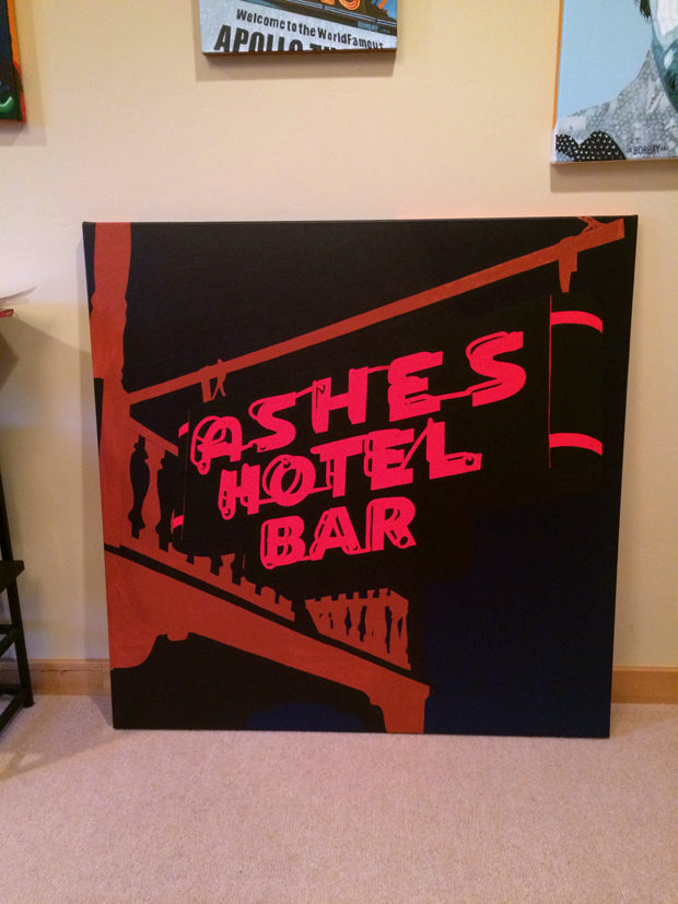
When painting light, chiaroscuro is the name of the game (with gratitude to Caravaggio). Such is the case, a dark sky sets the stage for visual drama and excitement.
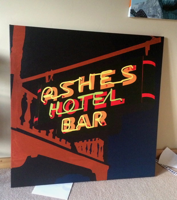
In baseball, this stage would be known as the payoff pitch. With the tubes illuminated… Ashes is beginning to breath.
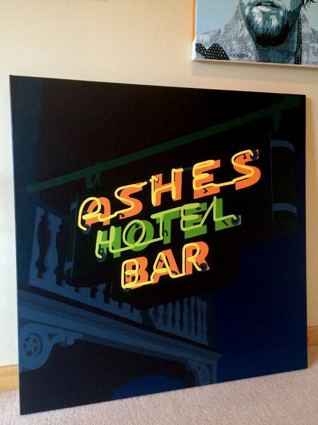
Payne’s grey, a blueish grey mixed with pthalo blue green shade, hookers green, cadmium red and titanium white — is one of the great greys. The deck has taken on a dreamy feel.
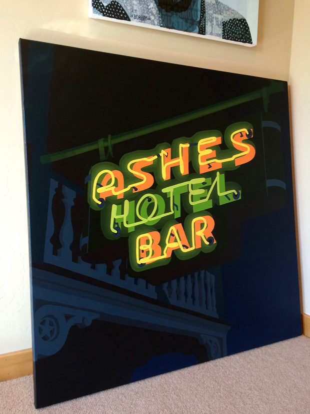
And now… with the letters and tubes accounted for… the ambient light thrown by the tubes takes center stage.
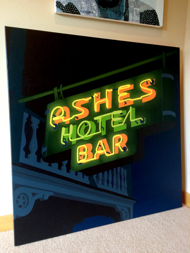
Each tone utilized around the letters has been applied to the support bar above the sign for lighting continuity.
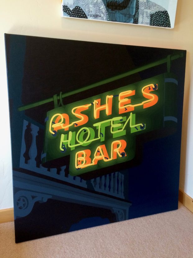
It was a green day in the Borbay studio…
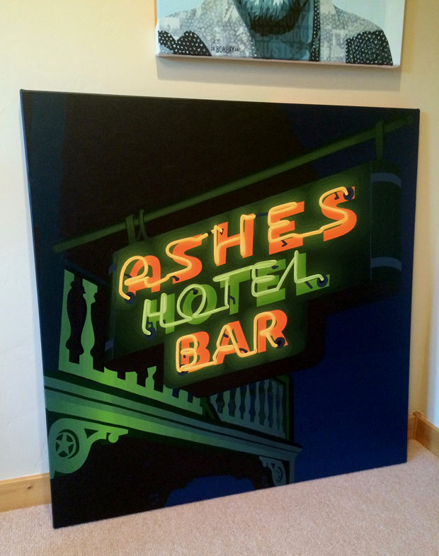
Now, the focus shifts to the deck… how will this neon light impact its surroundings? I estimated the angle of direct contact, applied highlights, and worked a gradient in either direction.
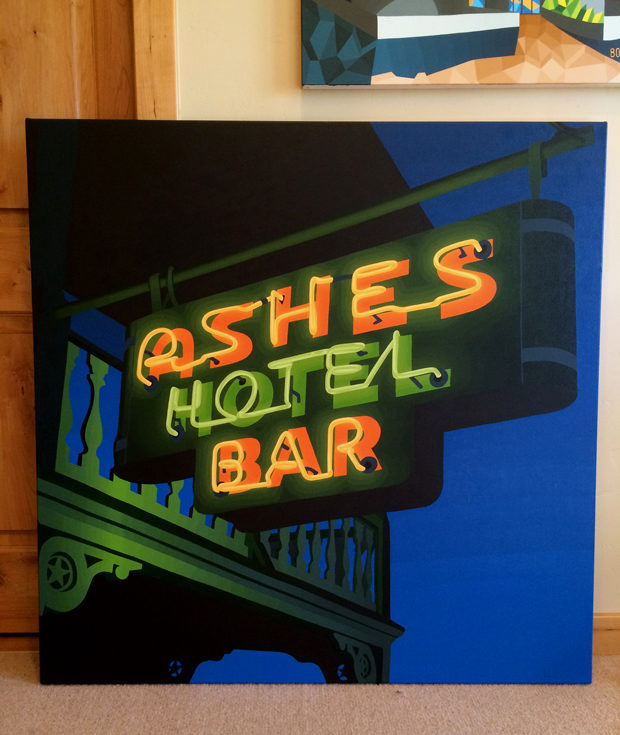
The sky was feeling too dark… so we decided to bring a greater level of depth in anticipation of the trees. This was a risky, but rewarding move.
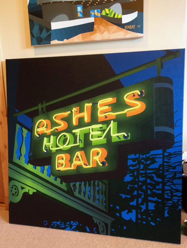
Channeling Bob Ross… some happy trees join the party… the pine trees tall, after all.
Adding layers of leaves, branches, bushes and exploring the inner botanist in us all. Each letter behind the tubes has been repainted in a five tone gradient… subtle, but meaningful.

The final touches, including the detailing of supports beams, shadows, tree highlights, rivets and some intimate graffiti — and voila. Ashes! It was an honor to create this painting, celebrating a man, a community and the beautiful mission: improving the lives of children.
A limited-edition series of this painting were donated to Project Morry, with 100% of the proceeds from sales benefiting the children served by Project Morry. Stand by for an open edition series… thank you for being here.
