Earlier this year, I was contacted by Jim Carney and Susan Weeden to discuss their new project — Bomb Wines. My name was kindly sent their way by former American-Record holding steeplechaser, art collector and friend George Malley.
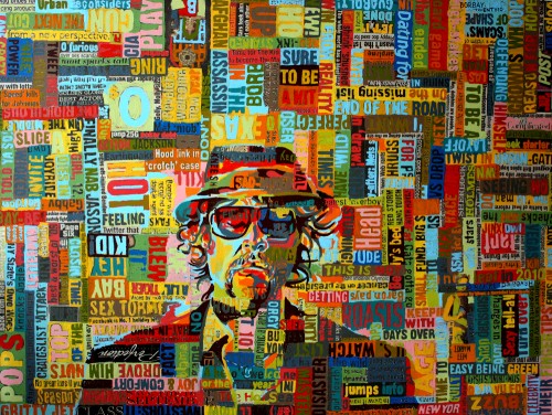
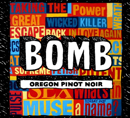
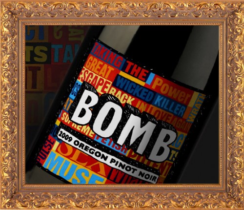
After a few conceptual meetings, we decided to move forward with a commissioned collage painting and logo design for Bomb’s first wine release: a 2009 Oregon Pinot Noir. The objective was to create a colorful, hand-crafted, explosive visual identity — apropos for a brand with the name “BOMB”.
Here is a look at the creation process from start to finish.
THE PAINTING
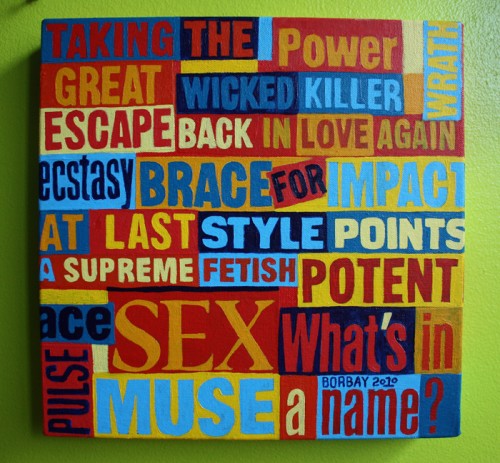
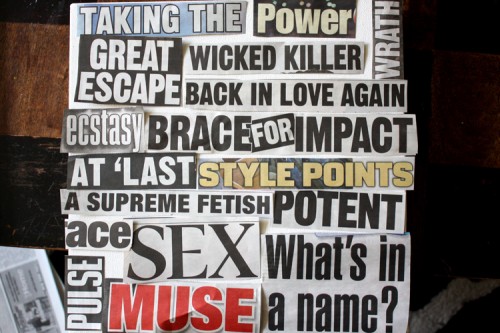
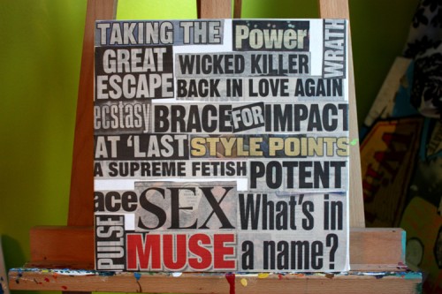
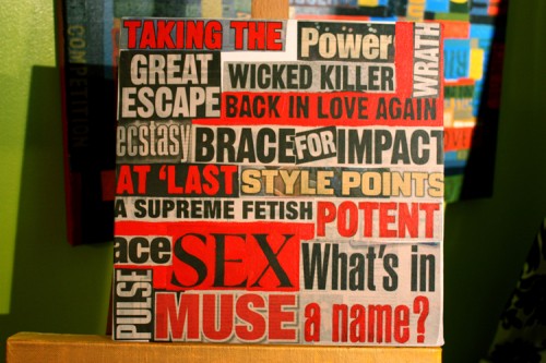
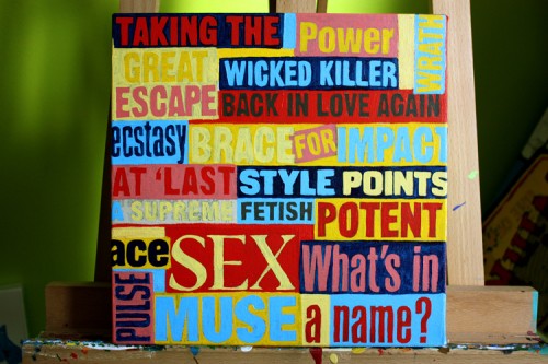
There was much to consider for this canvas. From a pragmatic standpoint, we had to consider the shape of the label… which was set to be horizontal, but not terribly wide. This lent well to a square shaped canvas with a border. Then, there was the choice of headlines…
When creating a painting for a consumer brand, particularly alcohol, we had to consider legal issues. Therefore, Jim, Susan and I went back and forth with several proposed headline layouts prior to moving forward. For BOMB, we had to dance all over the line of risque.
Once we set the headlines, they were fixed to the canvas, and now it was on to the painting.
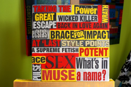
My palette inspiration began with the primary triad.
Red and yellow, an alarming pairing.
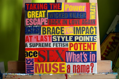
Working into the picture with a deep blue, and then pink.
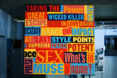
As soon as the secondary triad come into play, the complexity of the picture begins to shift and take on a personality.
I got the blues.
Yes, I took this picture upside down, that is why it feels strange. It’s in my parents kitchen on Long Island. At this stage, the painting is now beginning to feel cohesive.
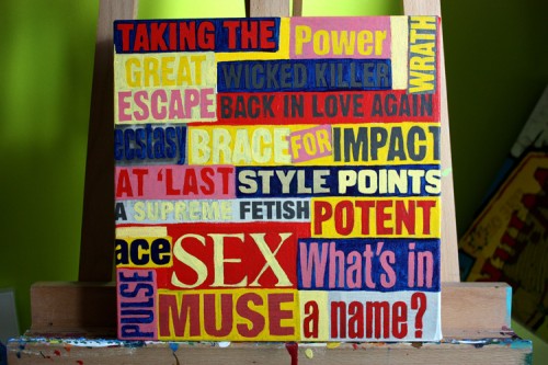
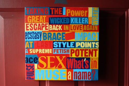
Color play with the proximity of complementary tones… I wanted the color balance to reverberate and thus jump off the wall… or shelf, if you will. Viewing the painting on a deep red background was helpful.
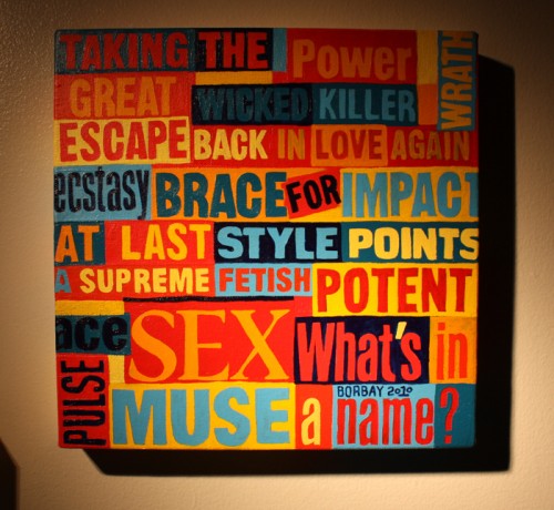
And completed, shot in low light to convey the mood of the painting.
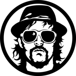
The jump-off point for the BOMB painting was my self-portrait, which I created back in January of 2010.
THE LOGO
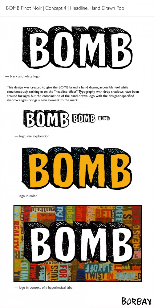
Here is the new Bomb Wines logo. Getting to this point took some time, including a good deal of research and mining for inspiration.
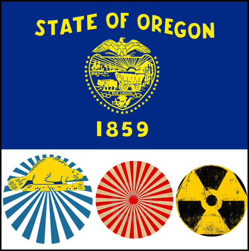
Considering the initial release of Bomb Wines was an Oregon Pinot Noir, I wanted to get a feel for visual symbols representing the state of Oregon, as well as a set of powerful circular visuals.
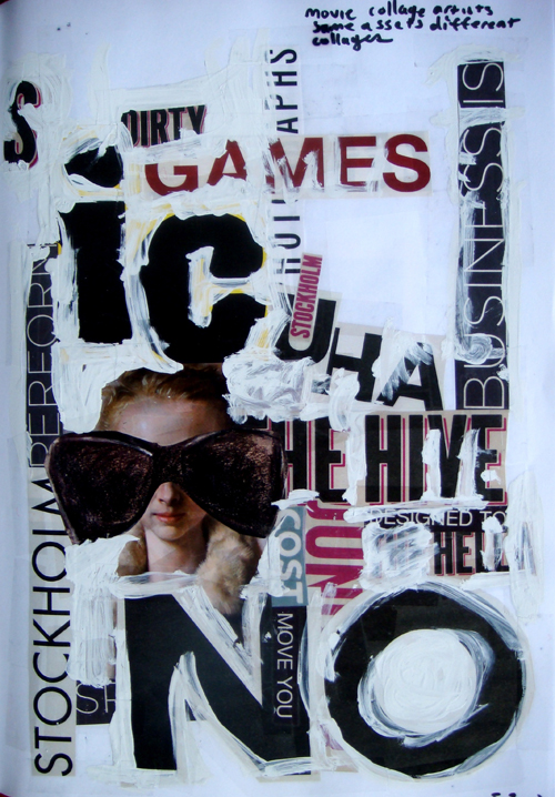
I’ve always been fascinated with hand-created typography, this was a collage from a few years ago.
Another collage for inspiration… created in Stockholm, a variety of typography in one place.
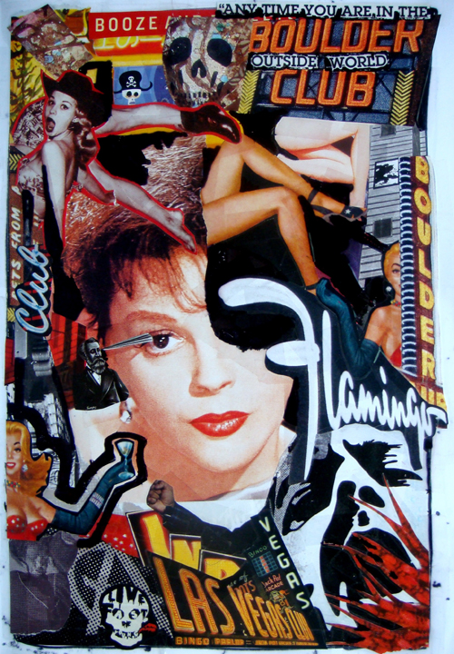
This sketchbook page was created out of a classic Las Vegas book… signage in Vegas marks the epitome of contrast and readability.
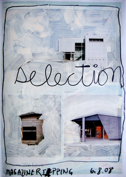
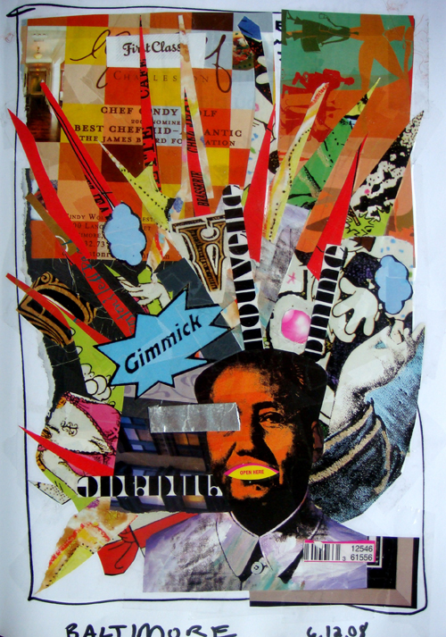
Text, image and color reference… made on the way to Baltimore.
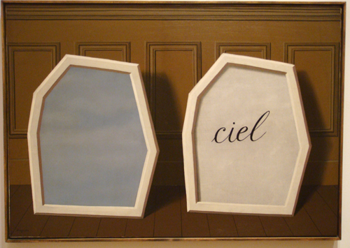
Magritte’s interesting use of cursive writing on a painting.
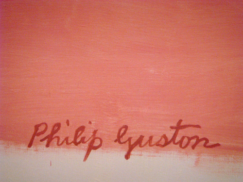
Philip Guston’s beautiful signature. Now, with all of these images and sources serving as a mood-board, I got down to the design work.
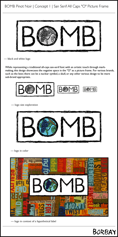
My first iteration was a hand-outlined version of BOMB in Gil Sans, created on my Bamboo Tablet. I decided to explore filling in the “O” with grapes, drawn from a photograph taken in Oregon. This version was a bit tame in context of the painting background. On to the next one.
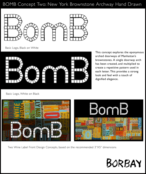
When I was walking down the street, I found myself captivated by the brownstone archways. Based on a photo, I created a vector representation of the stones, crude bumps and all, and cobbled together the name “Bomb” based on the repetition of the singular u-shaped arc. As with direction one, there was potential but it wasn’t exactly the right fit.
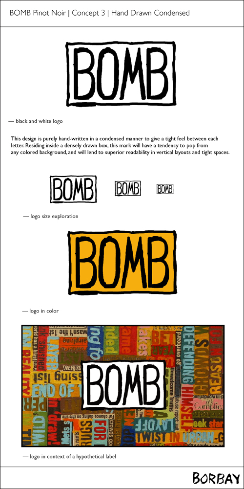
By the time I got to the third concept, I was beginning to feel a need for something visually uncluttered and handwritten. This was closer, but not quite there.
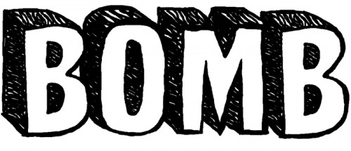
After the first three, I decided to make the the word BOMB explode forward from the painting. This was the result we were looking for, and it worked well with the painting and stands alone.
PUTTING IT ALL TOGETHER
The logo was hand-drawn directly in Photoshop, and the painting was created by hand. Together, the label is now complete… but it took a few rounds of designs to get there.
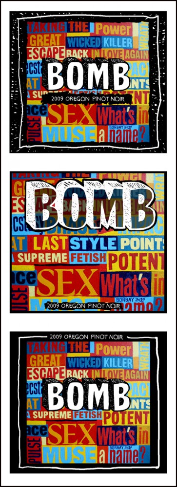
With both elements secured, I explored a variety of executions… it’s important to create multiple possibilities, if only to solidify your choice of the strongest option. The final touches came into play with the hand scribbled borders and a more carefully considered execution of the secondary text.
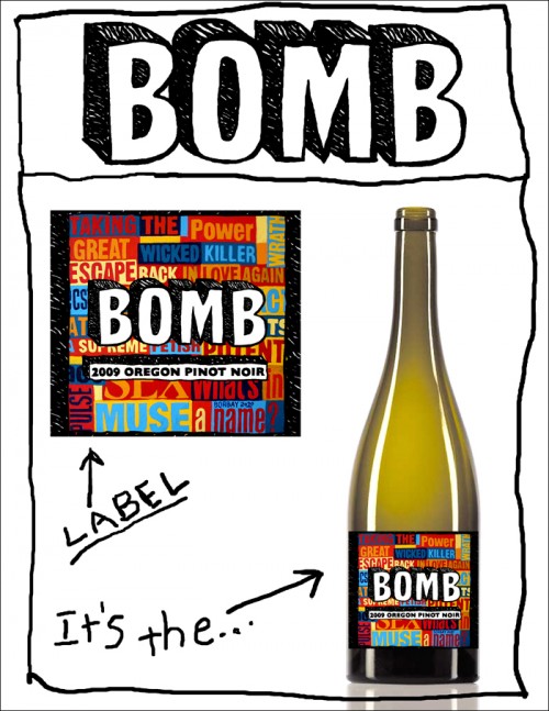
This was the final composition showing the label, as well as the label on the bottle. This statement will ring true to your taste buds when you get your BOMB on.
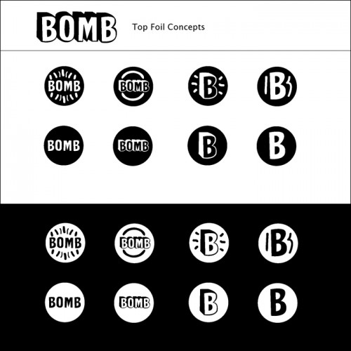
One of the final considerations was the design for the foil… I came up with a variety, black-on-white and the inverse. Want to guess which one we went with?
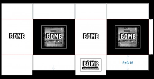
When you buy a case of BOMB, it’s BOMB on all sides.
BOMB NOW AVAILABLE
You can now buy your own bottle(s) of BOMB 2009 Oregon Pinot Noir… check (it) out here.
BOMB… THAT SOUNDS FAMILIAR…
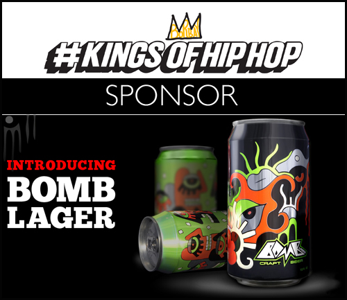
Bomb Lager was created by the same team… they were also the delicious sponsor for my #KingsOfHipHop opening reception.
IN CLOSING
Thank you Jim and Susan for this outstanding opportunity. I truly enjoyed working with you, and look forward to future collaborations. Thank you George for the introduction.
To all — if you have any questions about this project or my work, don’t hesitate to reach out.
