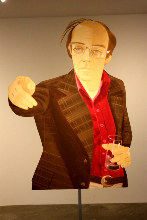
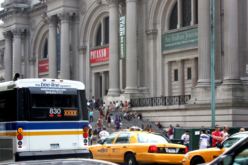
I want you! to pass this blog around to all of your friends, and for chrissake, hit me up with more Tom Collins. Ah, a trip to the Metropolitan Museum of Art… where the lessons instinctively flock like the salmon of Capistrano.
With a new portrait project on the horizon, and my lifelong mission to capture various scapes, I focused my trip on light and portraiture. After the jump, a chronological recap of my journey from the street to the Met and back.
It’s good to see we aren’t wasting water in Manhattan.
Man down. We have a man down. That’s what Red Sox bars get in Manhattan.
Shake Shack to the Yupper East, Lane Bryant is smiling somewhere.
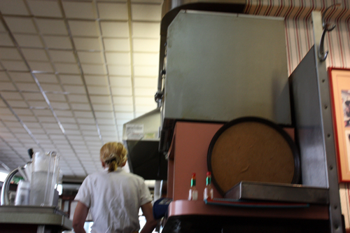
Lexington Candy Shop for a sandwich. It’s like going to your friends house when you are twelve; and you are treated accordingly.
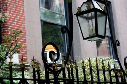
The lamp is perfectly framed within the wrought iron fence; wrought iron has slag.
I let myself go back to high school art class with this doozey of an unoriginal.
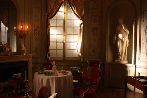
Nothing beats getting lost in these old timer rooms, imagining your previous lives.
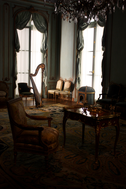
Don’t harp on the fact that the fake natural light in this room is better than the light in your living room.
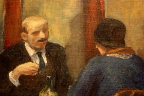
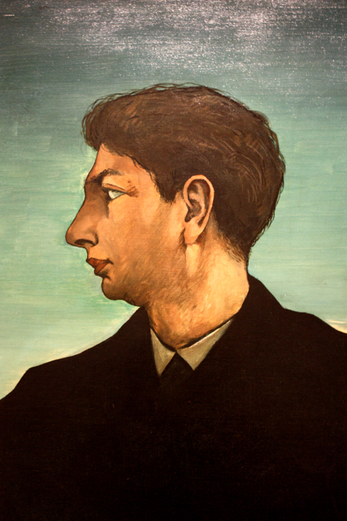
Down to portraits. Eyes are totally overrated. When you can capture the gesture sans eyes, you are masterful. Whodunit?
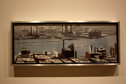
Believe it or not, Georgia took some time apart from painting girly-part flowers to crack this industrial sweetness.
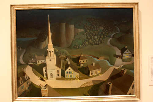
Wood getting his Paul Revere on. This is a wonderful example of pictorial plausibility… while the landscape is compressed and abstract, it works in the context of this dreamlike scape.
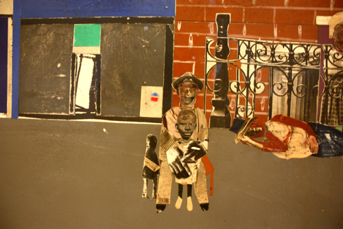
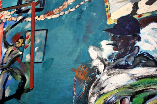
Bearden is always appreciated by this guy, who always has his Mustache-on.
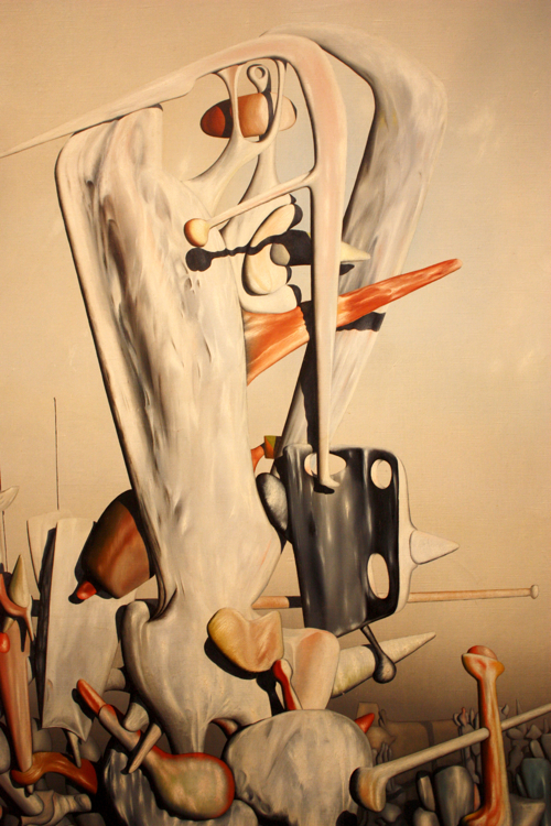
Here’s hoping I don’t wake up in this one.
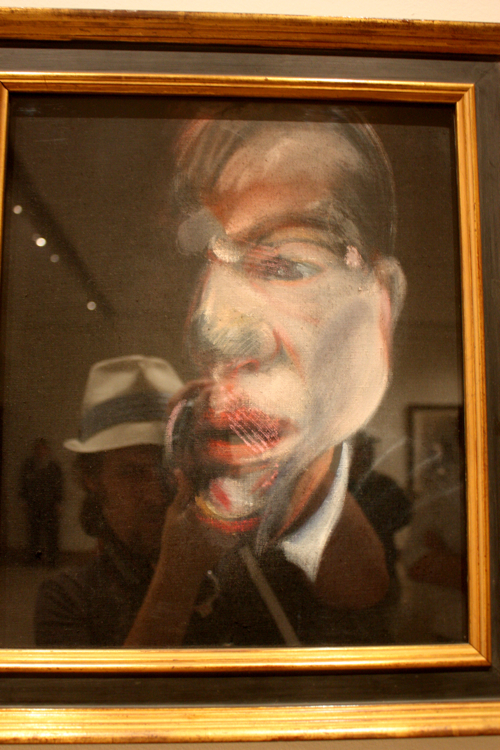
No egg sandwich or summer Hollywood blockbuster is complete without Bacon.
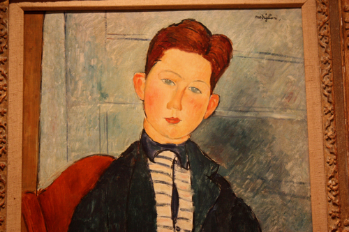
Children. Of. The. Corn. Modigliani of course.
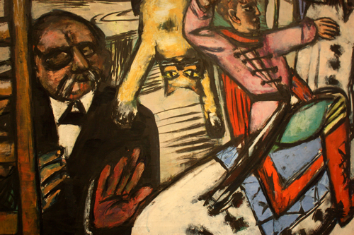
Good ol’ Beckmann, perfectly merging the drama of theater with the Johnny Drama of his strokes.
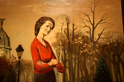
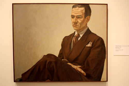
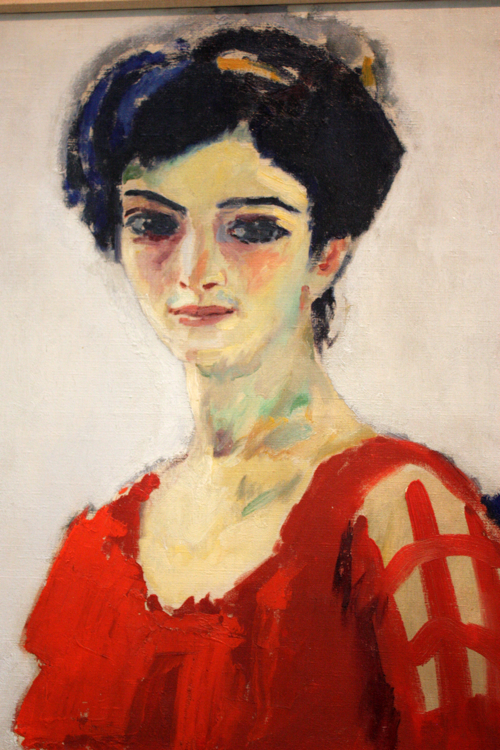
Pensive in a red shirt. The red makes it modern. The pensive look makes it timeless.
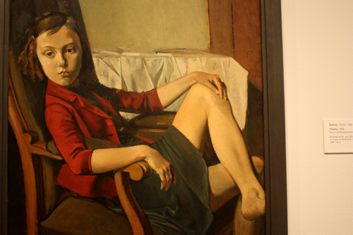
Balthus loved his adolescent girls, and they in hand loved his canvas.
Years later, he was cast on the Sopranos.
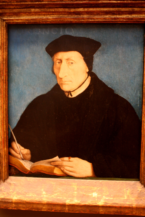
Artists have been wearing sweet hats for some time.
Never give up hope.
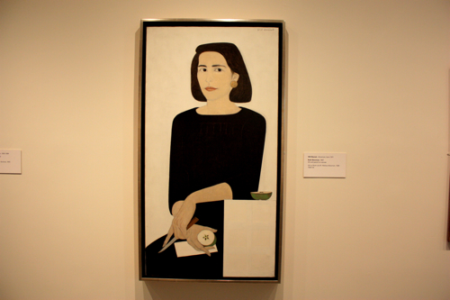
Alice Neel is nasty, in a good way. Like, damn, that new Porsche is nasty. That kind of nasty.
Happy Katzer. Love how this painting feels like an angry, dirty photograph.
Saw this new gem for the first time, bold marks, aggressive unbalanced composition – this is merely a detail.
How close?
Chuck Close! Now please, back away from the painting and stand behind the small rope on the floor.
That young man went on to do some interesting things, he was also painted with great frequency.
Detail shot of a man in the background proving without question, that a sense of humor is timeless.
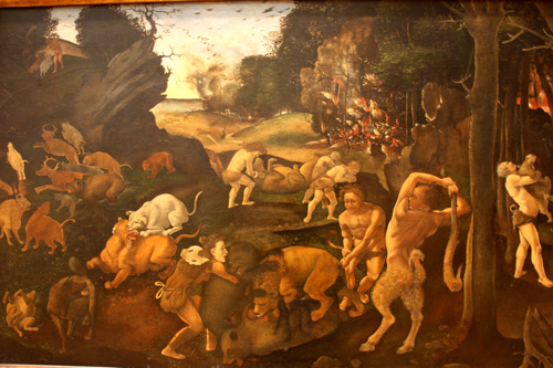
Ditto, to the gentleman on the bottom right, grabbing some calf.
Betty Draper circa 1300.
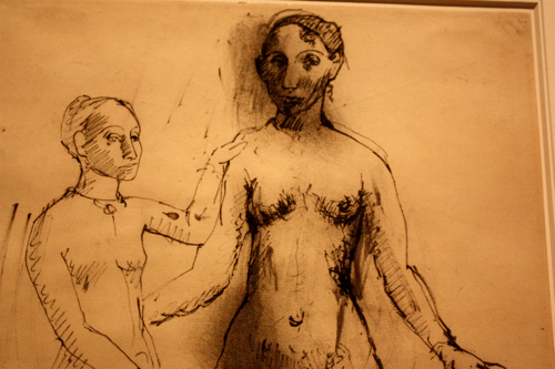
Picasso drawing with great strokes.
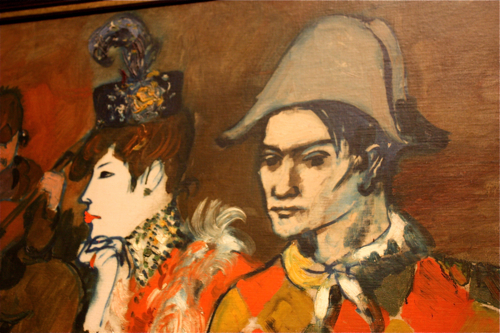
She is so mad at him for wearing that cap, he wasn’t even a naval officer. He bought it at a thrift store. She is trying to figure out where she went wrong.
Look at those faces, more expressive that 50% of the people on the 6 train.
Look at the top of this blurry picture… words! Lettering, creating texture in the background. For some reason I am drawn to this.
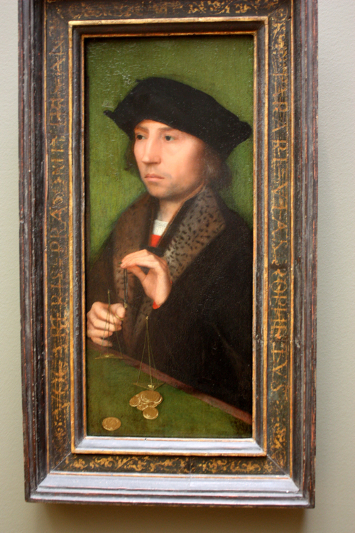
This guy looks like about 30 people I went to high school with. Love the green background, al dente.
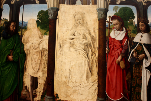
When you are the King, you can have advisers and women ripped out of paintings.
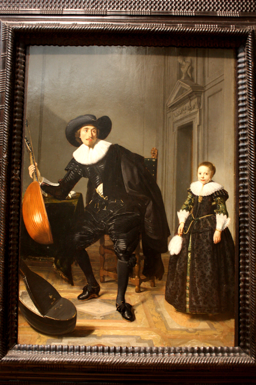
The musician takes a moment away from strumming to make a different kind of music, which remains unappreciated by his daughter.
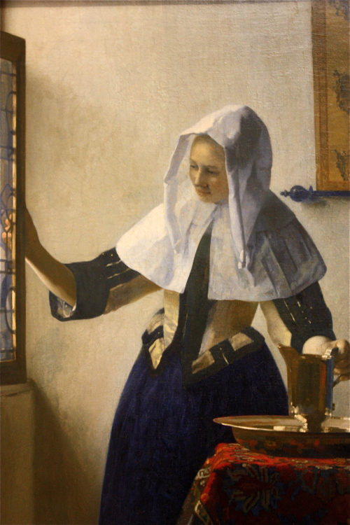
Vermeer’s MilkMaid was the Paris Hilton of the art world for a minute.
Kids are writing graffiti. Dog is pissing on the wall. Some things never change. Money says if this painting was a video, piss dog would then chase after that other dog to mark some more territory. Gross. This was relatively scholarly until I wrote that. Just kidding, there is no scholarly gains to be had here, move along.
A splash of natural light, better than 99% of the photographs I have ever seen.
Parisian art school. Here, paint this hallway. See you in six months.
A courtroom sketch from Rangel’s initial hearings.
Nice use of color, kind of looks like Brenda from Six Feet Under – which I just completed by the way. The ending was blaggity blah.
Rainbow.
How an artist can endure the cold enough to accurately capture this, I will never know. It’s huge.
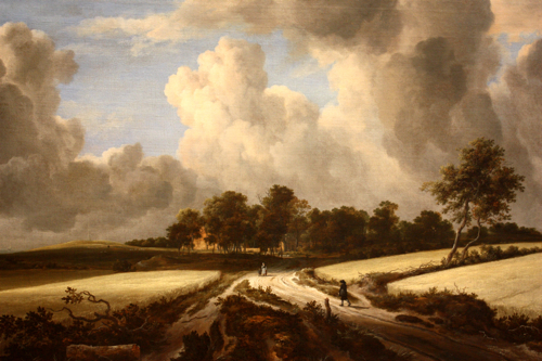
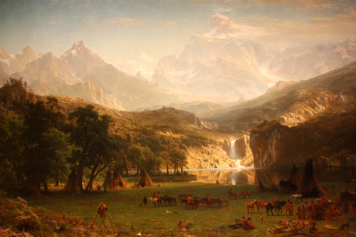
This painting is a knockout. Atmospheric, nearly overwhelming.
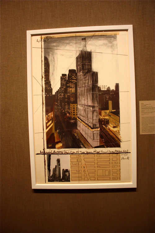
Christo wrapped stuff around buildings, and he became huge. His drawing skills are exceptionally good, like an architect eating special brownies. He actually digs raw garlic and soy milk.
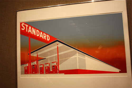
Will avoid the “being in a Ruscha” joke.
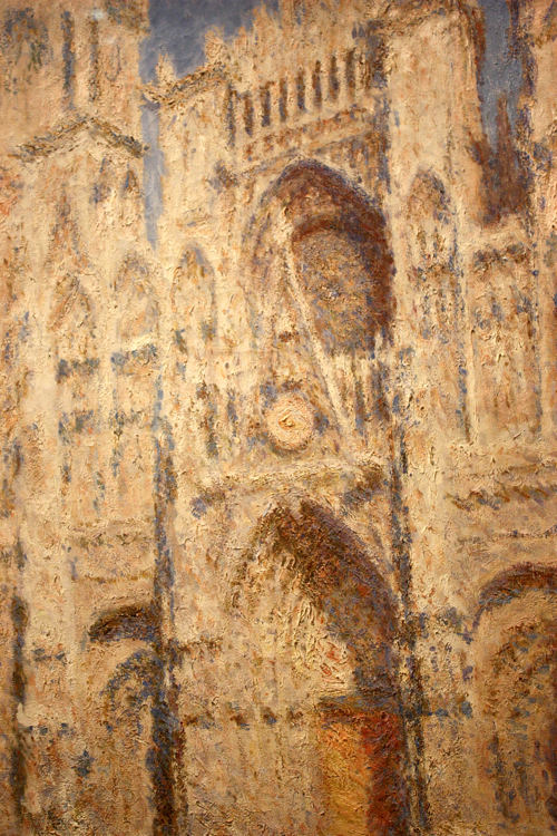
Monet is money.
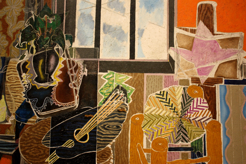
A smugly captured studio.
Vincent and his flowers. Love that blue anchor line.
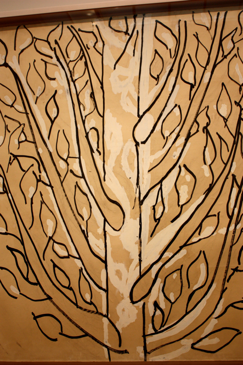
Ending with Matisse because he is incredible. Who mounts paper to a canvas? Matisse does.

