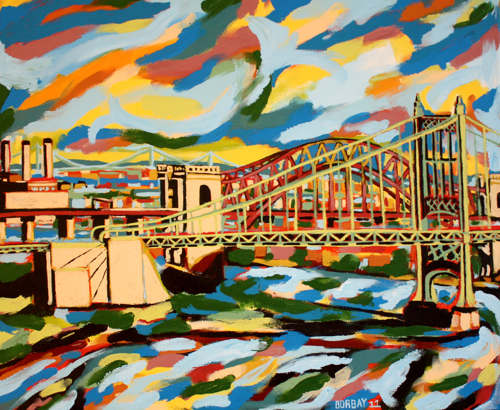
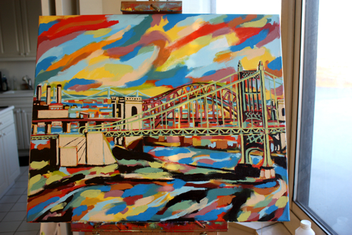
In a move of great fiscal responsibility, the city renamed the Triboro to the RFK Bridge. While I don’t agree with Koching every bridge in a money-hemorrhaging city, I do enjoy painting them. In fact, this commissioned picture was based on a previous Triboro painting I created.
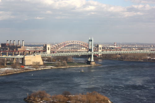
For this go-round, I was fortunate enough to have a good friend with this stunning view from his kitchen.
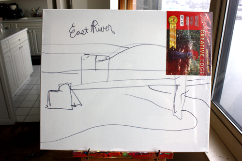
Beginning with a quick sketch on the plastic wrap to nail down the composition.
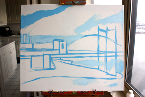
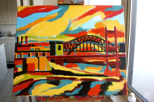
Two tones of blue to get things situated.
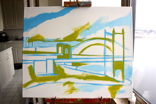
Bringing in some lime green to re-establish the bridge.
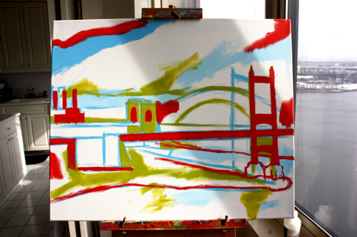
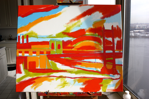
Adding some deep cherry, to define the initial contrast points.
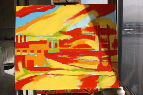
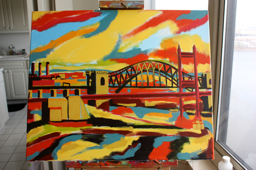
Some deep yellow, block out larger shapes of color.
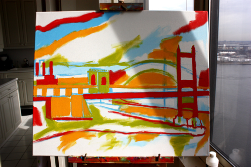
Adding a deep orange (borderline red) establishing the central weight of the image.
Balancing the picture with a yellow hansa, creating a warm-colored underpainting.
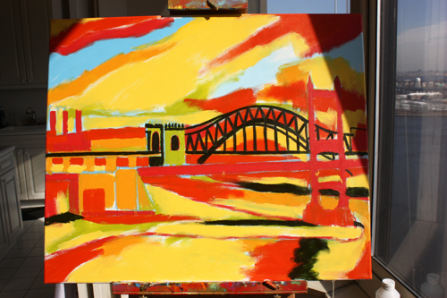
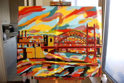
Beginning to create the bridge trusses in deep hunter’s green.
Adding purple, further identifying planes and darker portions of the canvas.
A deep aqua-marine blue, nailing down the horizon in the distance, as well as reflective surfaces in the water.
Another golden color, creating reflections on the bridge and identifying well-lit portions of the foreground.
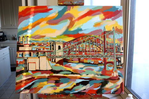
Adding the red on the bridge in the background on top of the deep green to create a natural color contrast.
The Triboro bridge receives a layer of bright green on top of the red underpainting, the inverse of the bridge in the background.
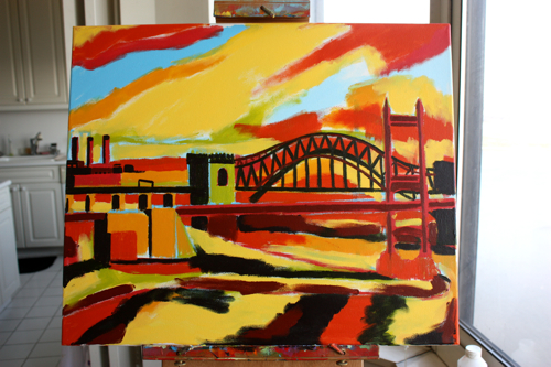
Nailing additional highlights on the bridge to accurately capture the light.
And complete. A special thank you to this paintings new owners, here’s hoping you love living with it as much as I loved creating it.


2 comments
Comments are closed.