As a lifelong Mets fan, I had a tough time with the demolition of Shea Stadium. Sure, it was ugly, had poor seating, limited vendors and was essentially an amphitheatre for airplanes — but it had winning memories.
However, I came to accept that Citi Field really brings the heat. It’s easy to get a beer, the seating rocks, it’s good looking, hell, the biggest problem with Citi Field is the recent/current cadre of Mets. Perhaps the title sponsor could arrange for a similar bailout?
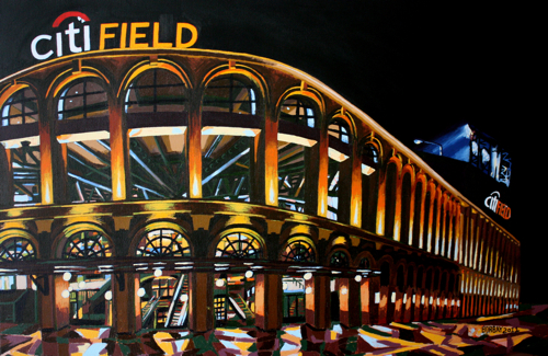
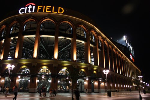
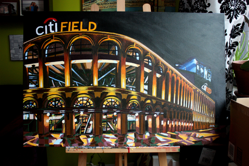
This picture was taken on my first visit. The dramatic night time facade makes it a terrific painting subject. After the jump, a stroke-by-stroke play-by-play of each inning.
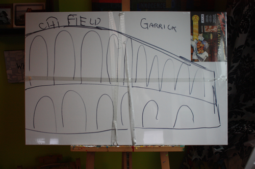
A shrink-wrapped sketch… see, there is still some need for a Sharpe.
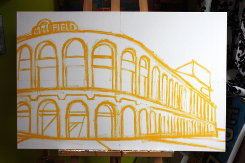
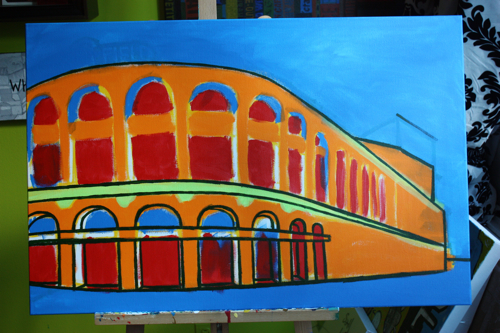
John Maine pitching a no-hitter through one batter. Ripping a fast yellow sketch in heavy body acrylic.
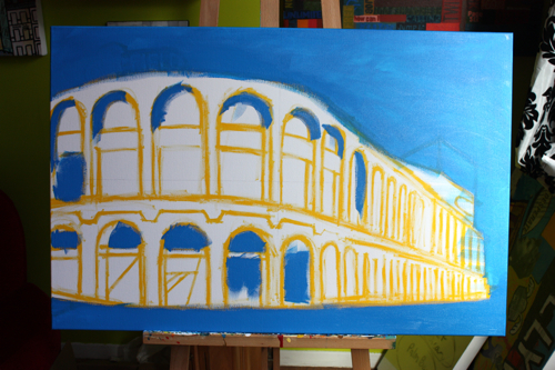
Floating the blues, I always start a night painting with a daytime setting.
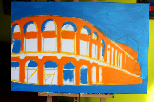
RBI single up the middle. It only seemed fitting to start with Mets colors.
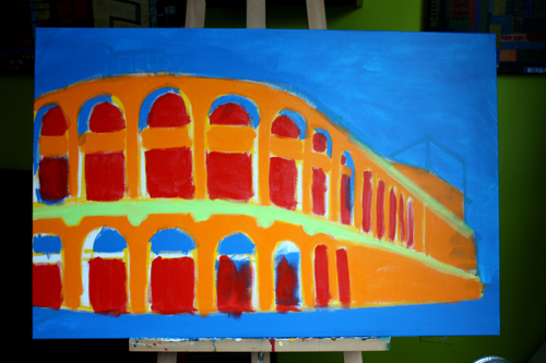
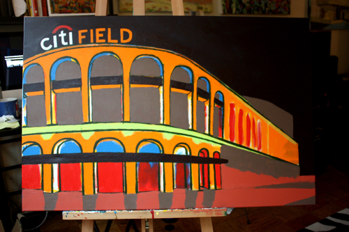
Red, yellow, blue, orange, green; primary and secondary triad minus purple.
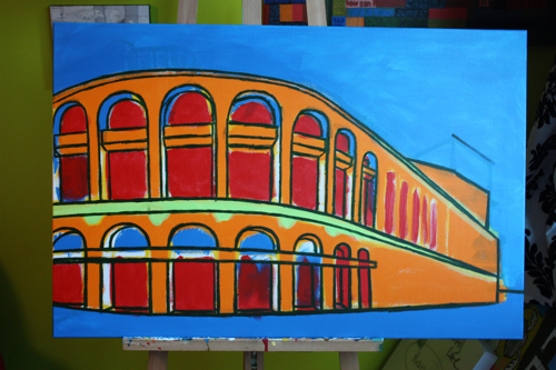
Starting pitcher looking good through three. Busting outlines.
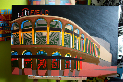
It feels Romanesque at this point. Minimalist.
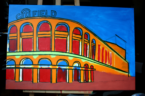
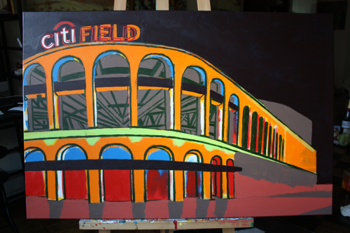
Drawing the signage and adding a raspberry feel to the foreground.
Unforced error at shortstop. A washed out paynes grey mixed from complements diluted by titanium white.
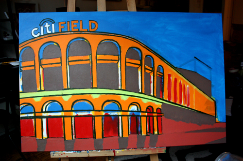
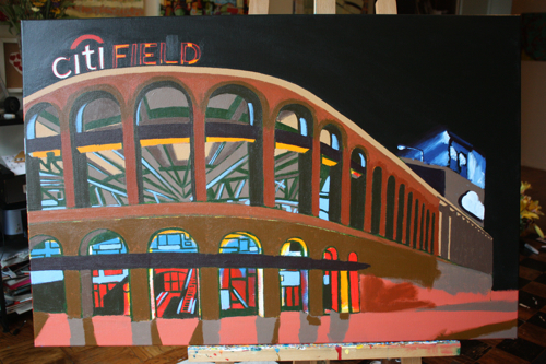
Adding the night sky, instantly shifting the tonality and feel of the picture.
RBI bunt. Redrawing the Citi Field sign for a better sense of perspective, and adding the interior girders. Love that word. Girders.
Fistfight in the family room. Finishing the interior in Hookers Green outlines.
Beginning to lay in some reflective browns.
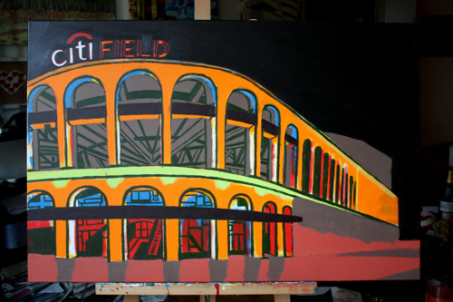
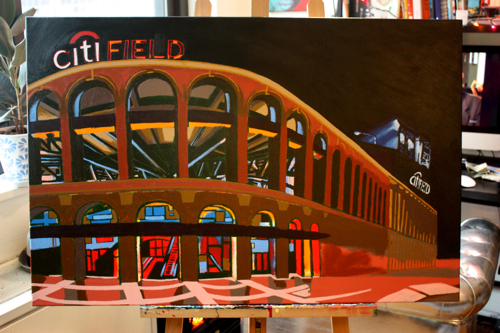
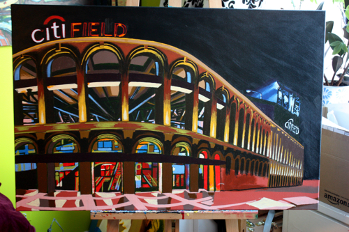
Pitcher hits an RBI double. Darker colors on the facade, bringing the entire image into the same tonality.
Painting in the spotlights in the background of the painting.
Manager kicks dirt on the ump, is ejected from the game. Tertiary colors, and a semi-abstract foreground layer.
Cutting in with some of the brightest points of the picture.
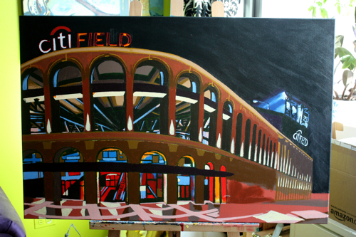
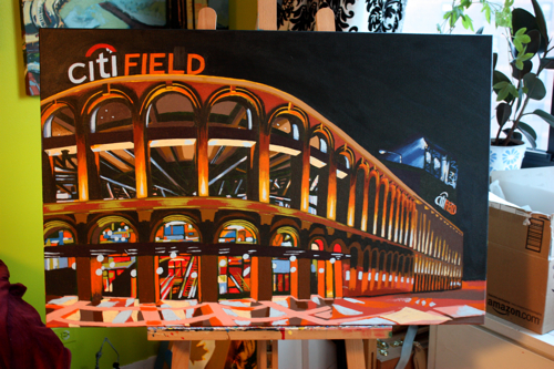
Up 5-2, however, two opposing men in scoring position, no outs and the starting pitcher is struggling. Splashing light on the columns… I wanted the final painting to be more dramatic than the original.
Mixing several colors and working them throughout the entire painting. This is what they tell you to do in art school, and it’s infuriating to hear, and almost impossible to practice, until you paint enough to realize it’s not just the right way, but the only way.
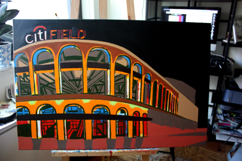
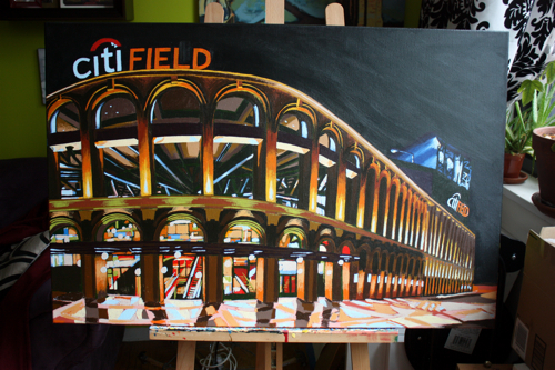
Star player hits a homer, but the home team is now down (contract year). Getting much closer, adding darker tones to the upper arches.
The foreground began to take on a life of its own, which I let ride.
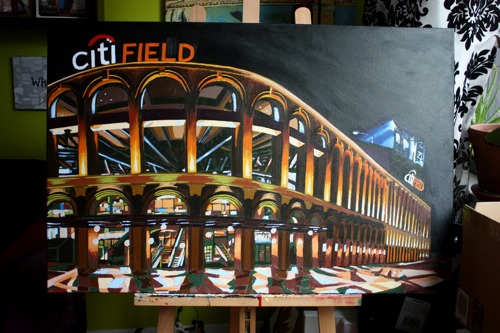
Big collapse, or major victory? Finally, adding the window frames, which was really the final touch.
Fin. Night paintings are particularly difficult. You must really focus to identify the correct complementary color pairing to nail the appropriate tone. This 24″X36″ commission will be delivered in the very near future.

A night painting so good it makes the sun envy the moon…beautiful work. The lighting is spot on, too!
This is probably the best thing the Mets have going for them this year 🙂
Beautiful! I don’t know if it’s my computer screen or not but I love the almost comic book quality to the shading. If you sold prints I would be first in line. A great painting of a great ballpark that doesn’t get the respect it deserves.
Fantastic! Another Homerun! The photo is good, too, but the painting is so much more. I love the depth and the colors…the highlights really make it alive. Whatever they paid you to do this, they certainly got their money’s worth. A masterpiece…kudos!
Tom