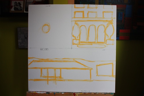
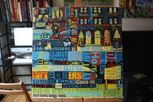
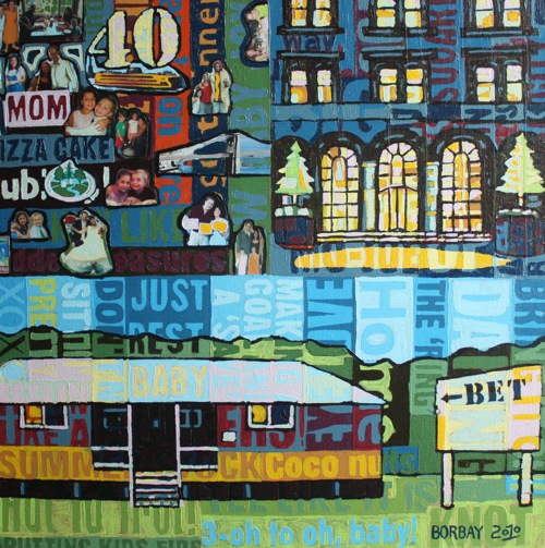
When Josh Krulewitz and I began planning this painting, he told me it would be a surprise for his wife’s birthday. Under the circumstance, we had to be extra stealthy and diligent to create a meaningful piece on the sly. After numerous back-and-forth emails, we decided on a three-framed image featuring meaningful photographs and locations in their life. In the upper left quadrant, there is a “scrap booked” section featuring family photos.
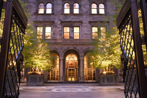
In the upper right, we chose the New York City Palace Hotel — where Josh and Tammy spent both their engagement night and 10th anniversary.
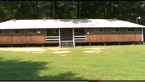
Finally, at the bottom, a bunk from Camp Tel Yehudah — the place they met.
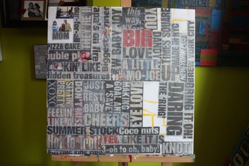
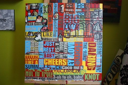
Choreographing a painting is the hard part… when you finally get down to the painting, it becomes a party. Starting with a brief outline in yellow.
With the under drawing guiding the collage, the New York Post headlines begin to populate the canvas. As always, some of the headlines are intentional, and others are incidental. The dynamics behind a family of four will explore every reach of human emotion, and I wanted to capture that. From “Papa’s on fire” to “Hidden Treasures” to “putting kids first” to “just rest baby” — this picture is an amalgamation of headlines taken from a day in our lifetime.
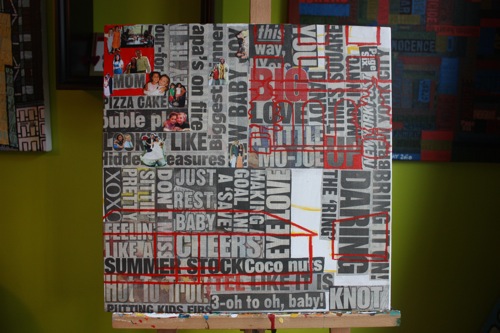
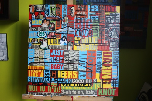
Now that the surface has some texture, a second round of outlines are added to help differentiate each panel.
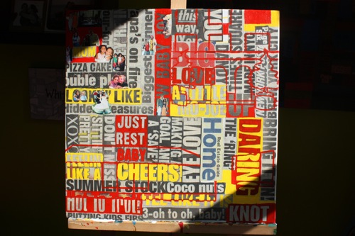
Ah, the lovely morning light slicing through the studio window. At this stage, I began adding to the scrap book elements, and finished collaging the bottom with “home”.
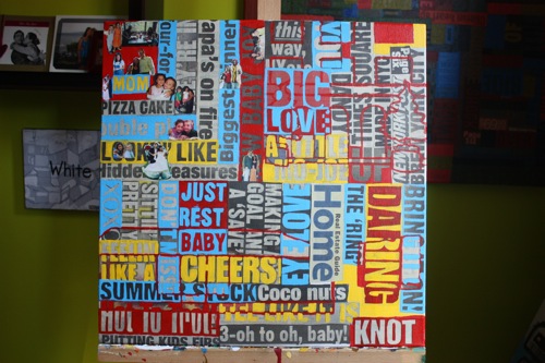
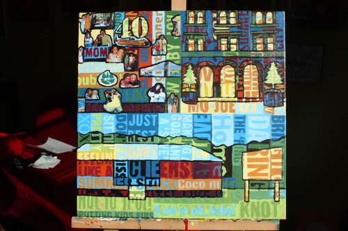
Red, yellow, blue — the primary triad, working its way across the canvas.
With the addition of green, I began the penultimate round of drawing/outlines, mixing a deep brown from complementary colors.
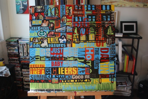
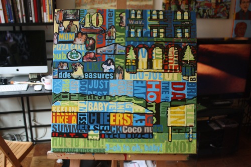
Fully drawn, and beginning to create a slight perception of depth with some darks.
Now is when the canvas gets re-confusing… adding some deep greens in the treeline and evenly applying each tone throughout the canvas. In the back left on the wall, you will notice the red and green Kat Ostrow painting I own, check her out.
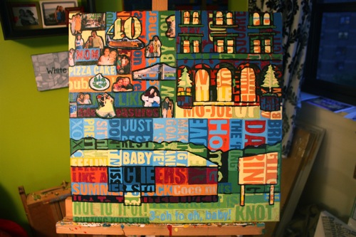
OK, the deep blues and purples are now making the canvas move. Here, I am working back and forth between light and shadow.
Now things are pretty calm on the picture plane, time to add the flare.
Ah, deep reds. I’m not sure what made me such a cadmium red medium fiend, but, alas, I cannot help myself.
The yellow/purple contrast is creating the night-time feel at the Palace, while the bright greens and blues at camp bring the sunny day.
And the final! It was a pleasure working with Josh on this, and I hope Tammy and the Krulewitz family enjoy this picture for many happy years to come.



Become a Borbay V.I.P.
You'll be first to hear about new works, pre-sale's, market updates and much, much more.
Welcome, I appreciate you, and can't wait to share the biggest news from Borbay Studios & Gallery!
You'll be first to hear about new works, pre-sale's, market updates and much, much more.