
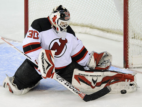
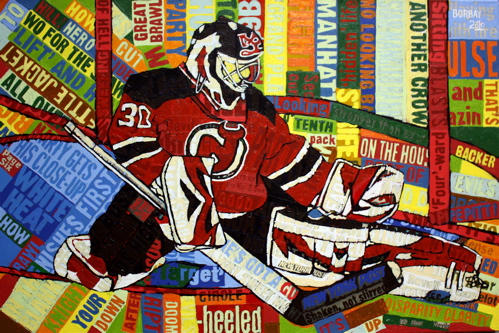
When I had the incredible opportunity to experience the Stanley Cup, I asked Cup-Keeper Mike Bolt (his father, Ron Bolt, is an epic artist) to recommend a goaltending subject… his referral was no surprise. Martin Brodeur, The Devils and Goaltending have been three in the same for 19 years. At this juncture in his career, he is fighting rumors of an early demise, despite shattering records and posting consistent numbers. This, I felt, was the right time to capture Marty.
My choice of subject was immediately recognized by Michelle Kenneth, a writer for Inside Hockey; by way of Fish, an incredible asset to the National Hockey League. After the jump, a step-by-step recap of the creation of Martin Brodeur, making a save with much on his mind.
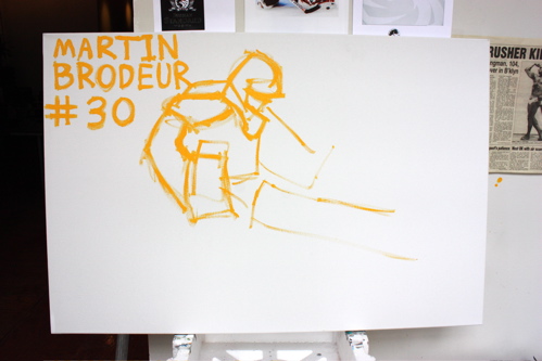
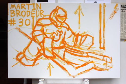
Starting out with the basics, Name, Number, Crude outline in yellow.
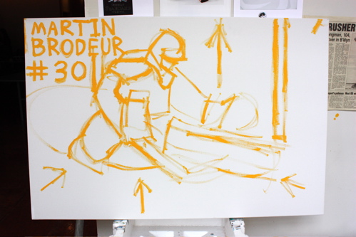
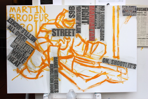
Further establishing the composition, exploring the directions for the collage to come.
A second round of outlines, to firm-up the composition.
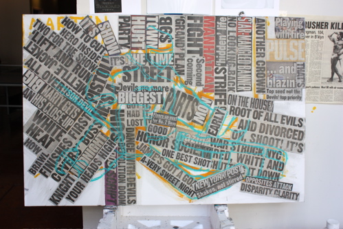
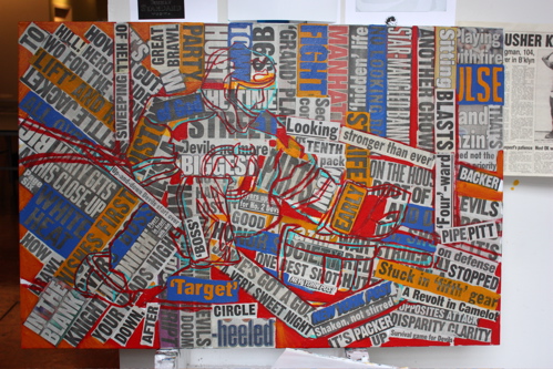
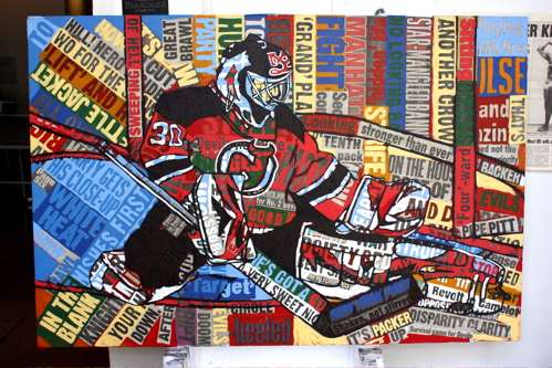
Beginning to populate the surface with headlines… “playing with fire” “no looking back” “Dance with Devils” “demolition doom” – all concepts and ideas I can imagine going through the mind of a netminder with constant media attention.
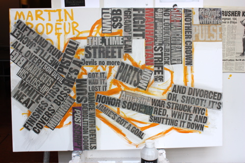
Adding more text.. some directly referencing the Devils in the paper, others, words I simply felt applied.
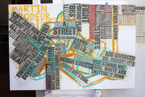
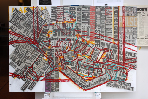
Redrawn in cyan.
Adding the collage is all about focusing on the vanishing point.
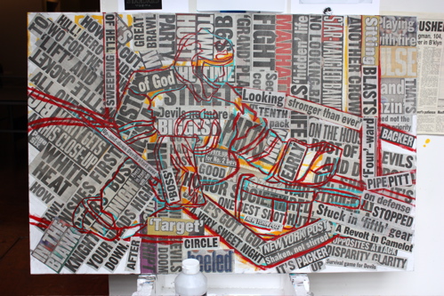
Yet another layer of drawing in red.
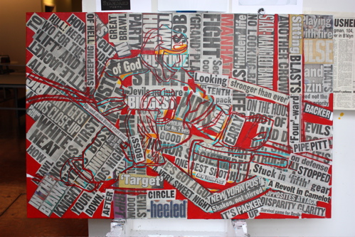
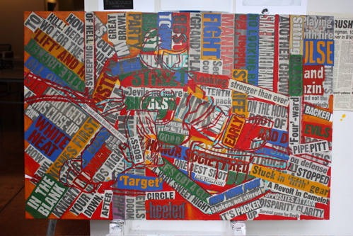
Fully collaged and ready to get down and dirty with the paint.
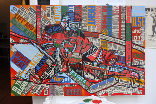
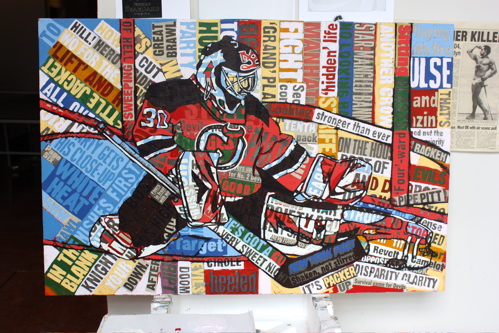
Filling in the gaps with pure cadmium red; an apropos color for the Devils.
Cycling around the picture with orange and blue, complementary colors and a touch of the Islanders.
Adding green, part of my standard color routine and an homage to the Devil’s jerseys of yesteryear.
Adding a well-mixed shade of deep purple, always an exciting turning point for the image.
Light blue, establishing the goal crease and highlights on Marty’s gear.
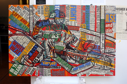
Two tones of red, finally enabling the image to emerge from the headlines and face the puck.
My favorite, a cluster of blues.
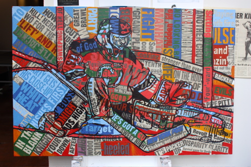
Adding more highlights to the background… at this juncture, I was thinking the background would be nearly all white.
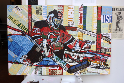
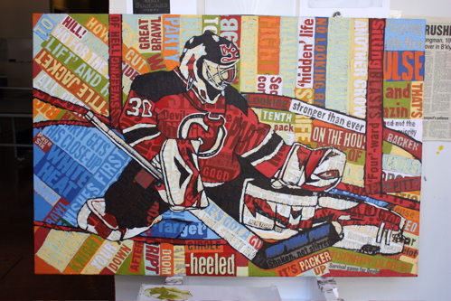
Here is the status shot that was promoted on Michelle Kenneth’s blog. Brodeur’s gear and pose strike such an old-school balance, it could almost be a goaltender making a save 20 years ago.
With highlights and darks established, Brodeur begins to pop.
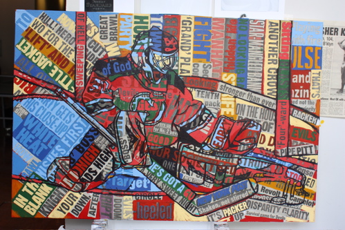
Working the background heavily.
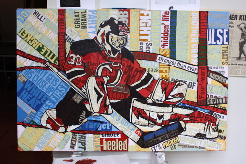
Nearly all white, becoming true to the reality of the scene.
Working in another tone of reds to make Marty stand out.
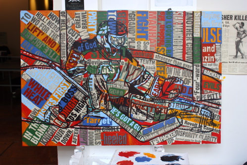
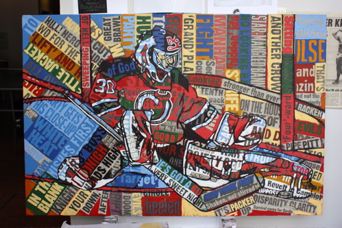
One more round of colors to spice up the surrounding space.
Kick save and a beaut! It was a pleasure to revisit my passion of painting hockey players, particularly goalies; which was something I did on a daily basis as a kid, dreaming of the NHL. This painting will be featured in my forthcoming group show on May 22nd in TriBeCa, Painting Resurrected. For any questions about this painting, my work, acquisitions and/or yours truly; please feel free to reach out at any time.

Fantastic work!
I really enjoy seeing your process and how your paintings come to life.
It’s really cool how you show how your paintings come together. And I love hockey so I thought this was really great.
That is some seriously amazing artwork. I think the process is what makes this so great to see. As A Devils fan and writer, it brought a smile on my face on an otherwise dark and rainy Monday.
Fun to check out your new work! Love the hockey aspect and as always I love to see the process! Good luck with the upcoming show!
nice painting!
hockey paintings