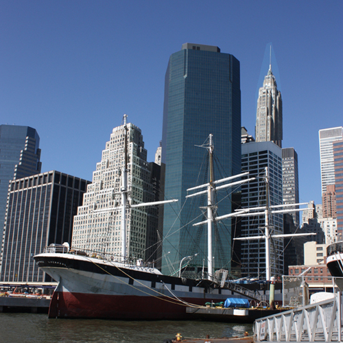
When Dave, Randi and I began discussing a commissioned piece, I asked them to think of meaningful places in Manhattan. After a few back and forth emails, they decided on the place they were married – the South Street Seaport. To get things rolling, I spent a sunny afternoon taking shots in the area from about twenty different angles. From there, I narrowed-down, cropped and emailed six choices to the Wenders.
After some deliberation, we decided on this angle – with an emphasis on AIG Building – which I actually blew-up in Photoshop, to enhance its presence in my source image. After the jump, each step along the way – capturing the place Dave and Randi were married.
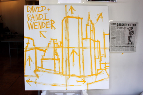
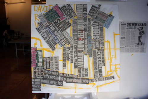
Beginning with the rough outlines, and traditional upper-left-hand-quadrant shout to the future owners.
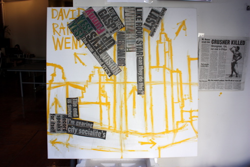
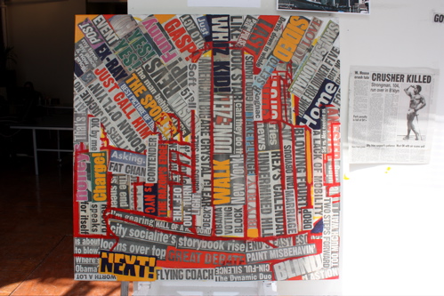
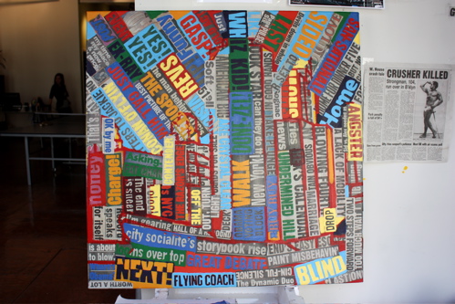
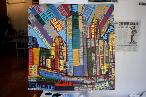
Beginning to collage, with a focus on the directional arrows… my objective was to create a powerful vanishing point to serve up an interesting sky.
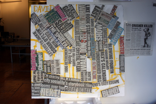
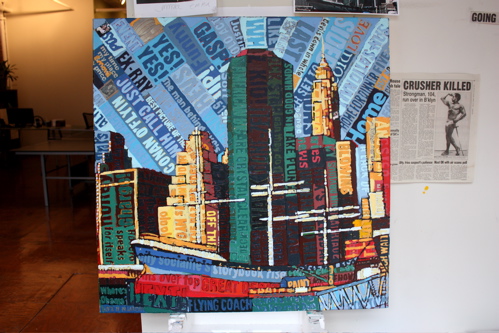
Further collage, focused on the directions of the paper. I now realize the somewhat morbid news clipping to the right of each shot – to explain, I loved this classic photograph of a 104-year-old strongman, and figured this guy lived one hell of a life; so I put it on my wall for inspiration. He may become a painting one of these days.
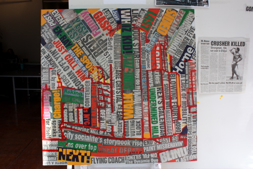
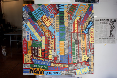
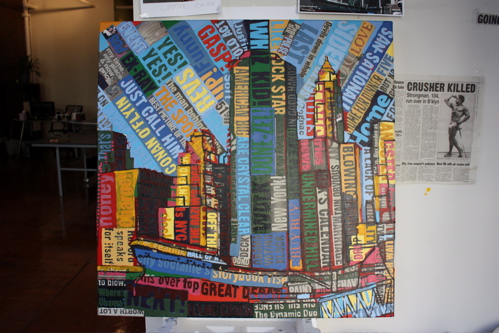
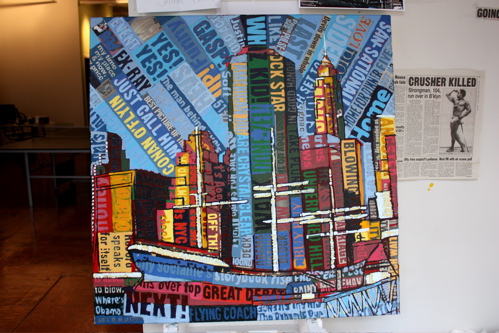
Continuing to collage the surface, as always using a mix of intent, and complete lack of intent within the narrative. In this particular instance, the term “Whiz Kid” received prominent placement, as Dave founded a successful trading technology company.
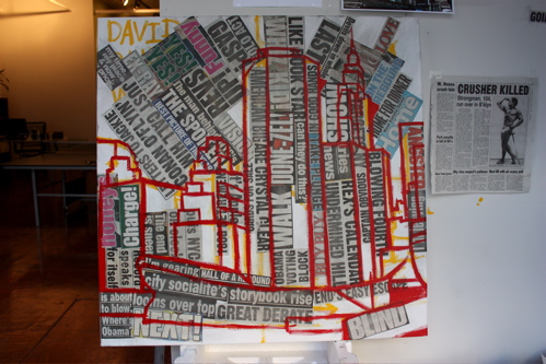
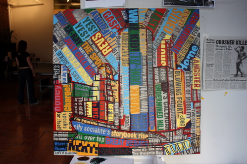
Bringing in the second round of outlines, to further secure the composition.
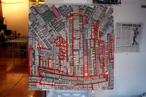
Continuing to collage the surface, focusing on direction and movement within the text.
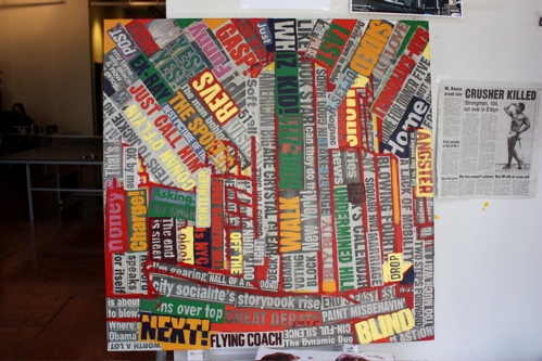
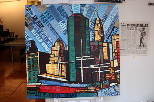
From here, I began to fill in some reds, and moved on to the secondary triad with orange.
With the water, buildings and reflections – there is an unusually large amount of green in this picture.
A brief round of purple was put on hold, so I moved right along to the yellow – choosing a really light tone to begin creating some visual separation.
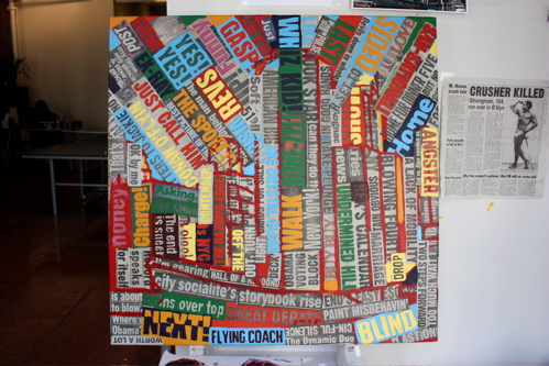
There is something so satisfying about applying a light, almost electric blue.
Another round of blue-green, beginning to establish the fore, middle and background.
Next up, some muted oranges. Many times, I focus on painting the complimentary color as a base – for example, there are currently many oranges in the sky. Applying blue on top of orange creates a more powerful final color… what lies beneath dictates the presentation strength on the surface.
Another round of fine outlines… this is where the image begins to come together.
Finishing the outlines. It is really helpful to define boundaries when working in this style, it helps create a push-and-pull textual balance.
No matter how hard you try to mix a dense orange, it always comes out a bit light due to the pigmentation… but this type of translucent addition can add some flavor.
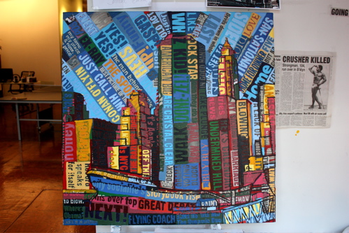
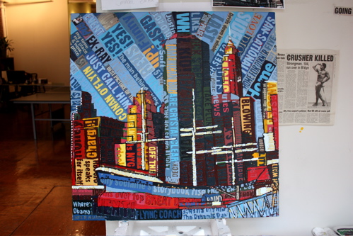
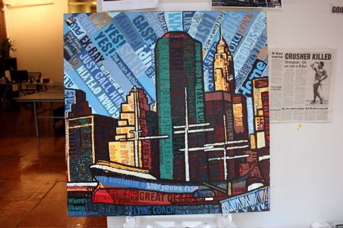
Drilling into the buildings, adding darks, beginning to define secondary planes and shadows.
A round of raspberry, a nice color which is appropriate for capturing reflective shade.
It really does come down to giving good mast.
Adding the lights in the fore and middle ground, it really begins to establish the final visual distance.
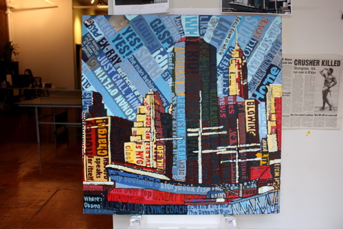
Shadows are so important, and when added in lieu of the highlights, creates a striking contrast. Also, I am a sucker for red.
Adding the yellowish lighting to a select handful of buildings in the background. Reality is abstract, often, the lightest point on a canvas can be the furthest thing from your vantage point… that’s why painting poses a challenge. Do you paint what you see, or what you think you should see?
Another round of blue green.
Oranges throughout, contrasting with the sky, which is constantly receiving a shade of blue here and there.
Ah, the satisfaction of some dense outlines… each painting differs, and this particular painting required outlines.
Some deep reds, getting close.
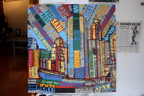
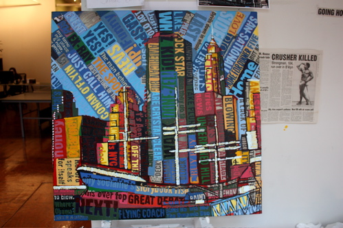
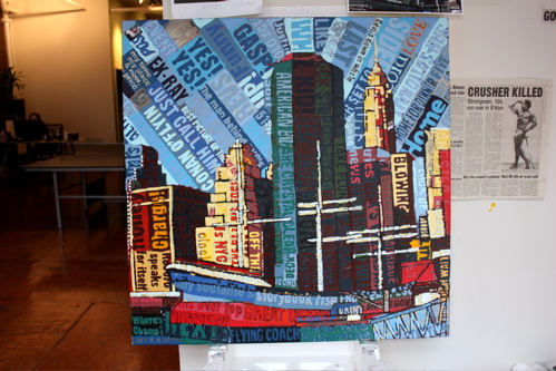
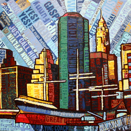
And the final piece. A slice of light was added to the front of the boat, to help balance the composition. This picture we incredibly enjoyable to create, and here’s hoping the Wender’s will love living with this piece. Please feel free to reach out to me with any questions you might have about my work, style, acquisitions or mustache.


4 comments
Comments are closed.