
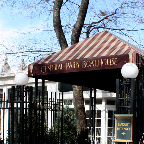
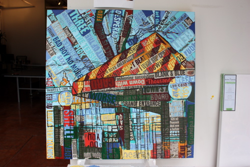
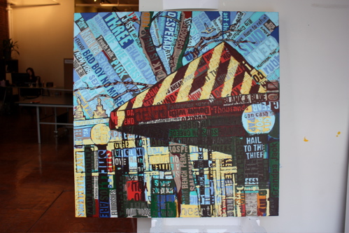
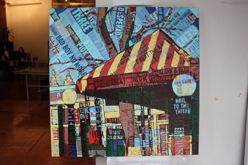
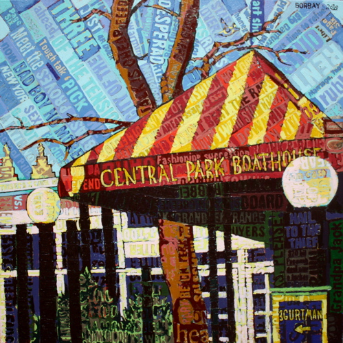
And the Central Park Boathouse commission is now complete. To recap: In early January, Stephanie, Scott and Ryan (their son) Gurtman came by my studio for an up-close-and-personal view of my work. With a vision of a painting in mind, we discussed a commissioned piece and the Gurtman’s decided to give the image some thought. The initial concept of painting J.G. Melon shifted to the Central Park Boathouse, they place they were married.
I met with the gang on a sunny Saturday, and we walked the entire perimeter of the Boat House, taking photographs… discussing angles, size and technique. After some discussion, we left the park agreed on the painting: the entrance way, 30″X30″ in my collage painting style. And so, the contract was drafted, and the painting has begun. After the jump, a recap of the entire visual process.
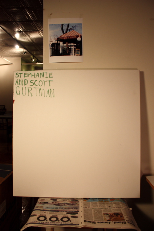
There is nothing in this world more frightening, and inviting, than a blank sheet of canvas.
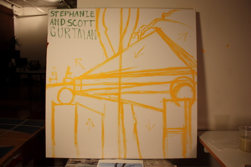
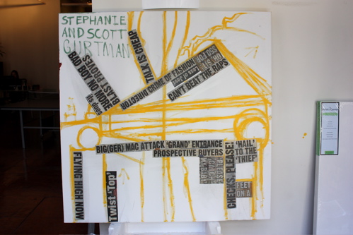
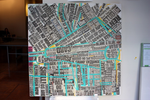
Beginning with a crude, quick contour line drawing to get my bearings and solidify the composition.
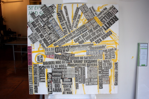
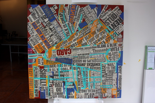
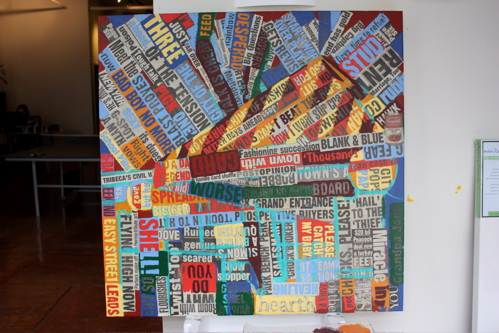
Beginning to populate the surface with collage, focusing on the directional shifts to create an underlying movement on the canvas.
Each headline is ripped from the New York Post, trimmed with scissors and scattered about a table. I then pick up the headline I am drawn to, cover the surface of the canvas with Matte Gel Medium, and apply the headline. The headline is then run over with a medium laden brush until the air bubbles are eliminated. Wash, rinse, repeat.
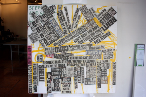
Focusing on the flow and sub-context of the type.
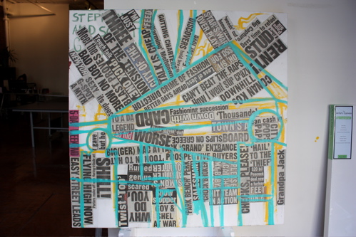
Working in a second outline with Cyan… 2/4 of the CYMK color process are now represented.
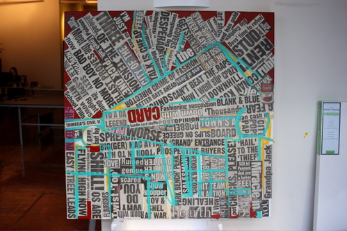
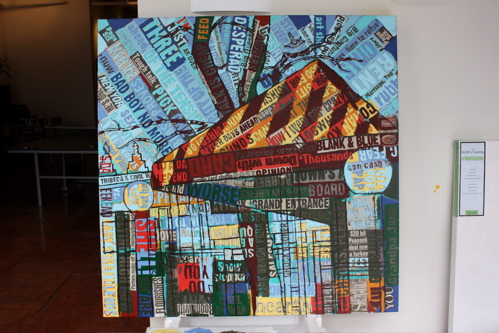
Finishing the collaged plain – I even added a Campbell’s Soup Can for Kitschy flair.
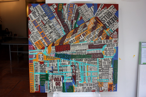
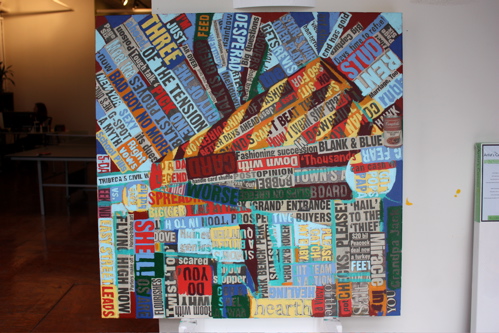
Here comes a deep, deep red… filling the void, grounding the image.
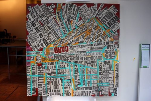
Rotating the primary triad, a deep shade of yellow… bordering on orange. This was the color I used to define the stripes on the canopy.
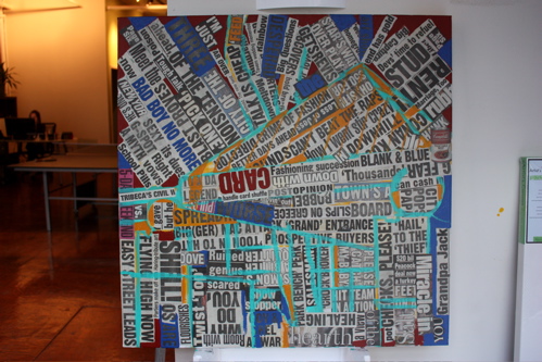
Peppering the surface with a deep, nearly straight from the tube blue.
Hitting the secondary triad, a round of yellow-orange… my favorite color from the age of 4-8.
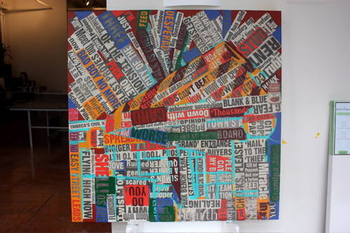
Bringing in deep green and purple to complete the secondary triad round – beginning to define areas of depth.
And, a round of electric, cadmium red’s, my favorite color – beginning to make things visually dynamic.
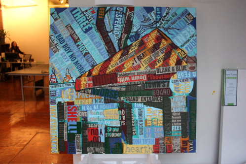
Bright yellows… once some dark darks, and light lights touch the surface, the image begins to take on personality.
Working a few rounds of blue throughout the sky.
Further establishing the background from the foreground.
The details of the background are quite firmly established.
A second round of outlines to help define the foreground, tree and buildings in the horizon.
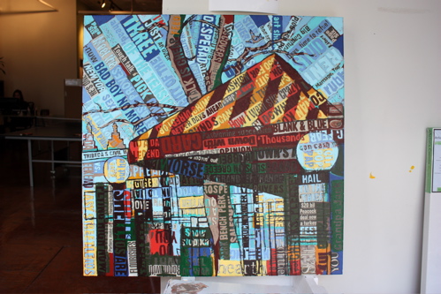
Working a round of burnt umber… I love adding the contrasting tones on both extremes, it really brings a surface to life.
Adding some muted, light earth tones.
Beginning to hack away at the foreground with a bright yellow, almost hansa even.
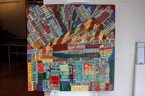
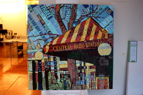
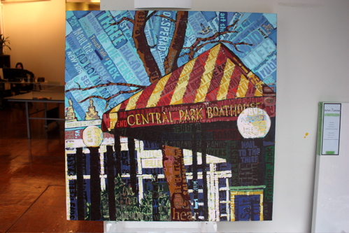
A muted red, adding to the surface of the canopy… if you look closely, you can see the “Central Park Boathouse” lettering has been added.
Adding the trees, working the canopy, establishing the foreground.
A near final round, really working on the contrasting points of light and dark.
And completed. A special thank you to the (3) Gurtman’s for commissioning this piece – I hope you enjoy living with it as much as I enjoyed creating it.


This is great! What an inspirational style, so inspiring…90 SoCal highschool kids will emulate it over the next 3 weeks. You are the focused, featured artist, they will study your background, your work and process and then recreate and reinterprete their own original piece….but influenced by the BORBAY artistic style.
@Lora: Wow, that’s amazing – I am flattered. Can you please take photographs of the process of their creations, and send along the finals so I can feature them on my site? That would be fantastic…
I totally want to see what the kids come up with.