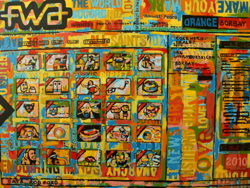
Adding The FWA (Favourite Website Awards) Site of the Day banner to a site is the interactive advertising agency equivalent of winning an Emmy. For the past ten years, Rob Ford has spent his days (and nights) building an awards showcase which has become not only an industry taste-maker; but a benchmark for client satisfaction and a career building distinction. During my tenure at Fi, each hard-earned FWA Award was merit for a company-wide celebration.
I left the digital advertising world to paint and share my work through social media. With the painting of this digital staple – life has come full circle. The internet has spread my name and work, and now I have captured a piece of the internet on canvas.
From the desk of Rob Ford:
“I had no idea what to expect from this painting but all I did know, especially after seeing some very impressive paintings from you on other subjects already, was that it would be unique and original. Without a shadow of doubt, you have created a true masterpiece here and I am delighted and also staggered by the end result.
As you know, The FWA is a project that has evolved over many years and its been great to see this painting evolve too, as I have been watching it grow via your twitter feed… most exciting it has been too! On March 1 2010 the existing FWA website will close and disappear off the face of the web so it gives me great heart to know that you have captured the real essence of the site and now we shall be able to proudly display your painting in The FWA office as a historical mark and point of reference.
I do believe that we shall be able to offer the painting as a digital wallpaper download as well so that fans of FWA can have this across their screens. I am totally blown away and thank you immensely for capturing something very special and close to my heart in such an unforgettable way! Borbay +1 :)”
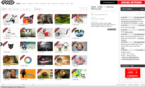
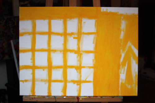
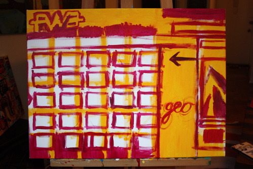
The essence of The FWA homepage reflects a careful, grid-based design with a perfect symmetry of tension. Thus, the canvas begins with a basic under-painting to capture the form.
A tongue-and-cheek color choice only a nerd could appreciate, I decided to use a CMYK (Cyan, Magenta, Yellow, Black) schematic for the first layer… the print-based color model as opposed to the RGB (Red, Green, Blue) foundation of digital imagery.
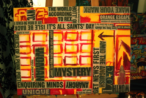
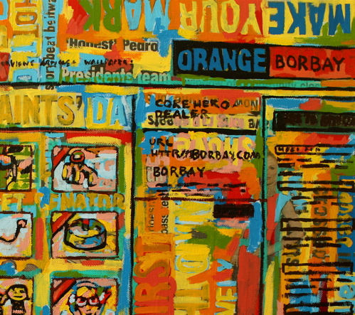
As I continue to create more paintings in this style, I am finding there is an underlying selection of meaningful narrative; i.e., “Make Your Mark” is obvious for winners, “Amid the Anguish” captures the feeling of the sites overlooked.
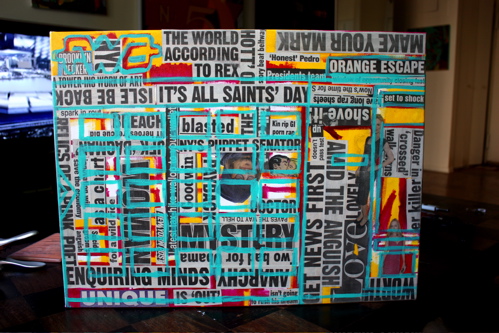
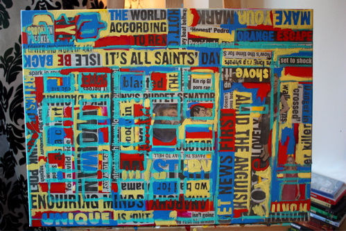
As the Cyan comes marching in… covering up Johnny Depp, Heather Graham and Sookie Stackhouse.
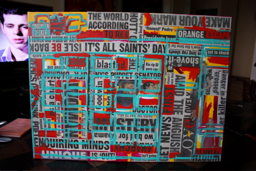
And here comes the red, which is part of the primary and secondary color rotation that is the process. As you can see in the background, I was getting some advice from hockey dynamo Evgeni Malkin.
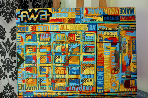
Red, Yellow, Blue – a primary color rotation complete… beginning to establish the form. At this stage, my objective was to build-up a solid foundation.
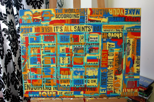
Moving on to a secondary color palette, orange is introduced into the fray.
A hot blue, creating more separation.
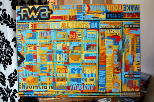
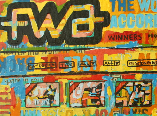
Drilling into the form with the addition of The FWA Logo and the sites’ basic framework. I made the conscious decision here to hand-draw all of the lines as opposed to masking them – A human creation in Photoshop, recreated on canvas without guides and rulers.
After a discussion with Rob, it made sense to immortalize a handful of Site Of The Month winners.
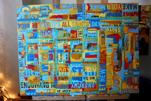
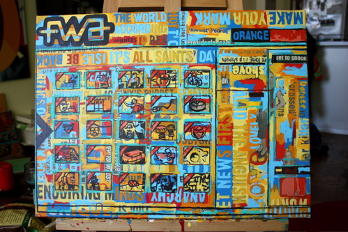
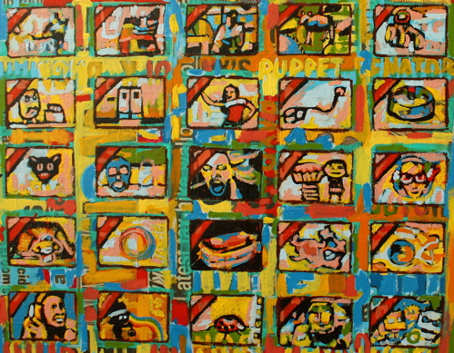
Here, the basic forms of the icons are taking shape on the left. The selected icons are for, from the top-to-bottom, left-to-right are: Adidas Teamgeist by North Kingdom; Wonderwall by tha ltd; HBO Imagine by The Barbarian Group and BBDO; SAAB – Change Perspective by Lowe Brindfors and ACNE Digital; Red Bull Soapbox Racer by Less Rain; BooneOakley’s new site; The GTI Project by Tribal DDB London; Lacoste Red! by Megalo(s); Labuat by Herraiz Soto & Co.; GE Smartgrid by Goodby, Silverstein & Partners and North Kingdom; The Turn by Fredo Viola & AER Studio; Come in to the Closet. Let’s Dance by Forsman and Bodenfors and Koka Kaka; Hotel 626 by Goodby, Silverstein & Parners and B-Reel and DinahMoe; Sour Sally! by Kinetic Singapore; How Music Almighty Are You? by Wieden + Kennedy London and Firsborn and Oddcast; The Eco Zoo by ENJIN Inc. and McCann Erickson Japan and Roxik; Spectra Visual Newsready by Fluid and SS+K; The Alfa Romeo 159 Experience by Soleil Noir; Coke Zero Game by North Kingdom; Red Bull Flugtag Flight Lab by Less Rain; Bjorn Borg by Farfar; Good Things Should Never End by Poke London; Picknik by Picnik; Halo 3: Believe by AKQA; and Paper Critters by JR Fabito.
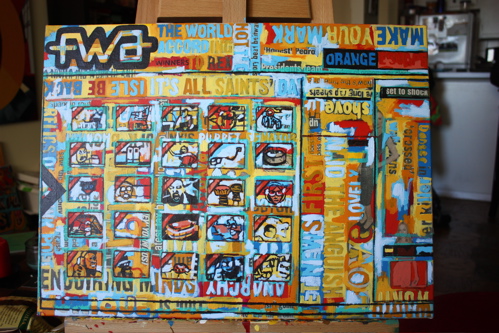
A round of near-white-blues to test the waters of a potential canvas white-out, and help break-up the space. It was after this layer that I decided to keep the colorful nature of the canvas – capturing the energy, excitement and eye-tracking patterns of The FWA’s many viewers.
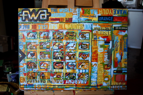
Working the details into the icons with several new layers of color, now, feeling close.
And the final. A professionally photographed version of this painting will be taken soon, and I will be offering a limited-edition series of Giclee prints. If you are interested, please send an email here… first come, first serve.
Detail of The FWA logo.
Detail of the icons.
Detail of the upper right quadrant. Fin.


Thanks again Borbay… you have no idea how much it means to me on a personal level for you to have captured a site which has changed mine and many other people’s lives. Thank you!