Rewind to December, 2010. I recall pondering a portrait series, but found I had 99 problems and picking a portrait subject was one. As fate would have it, I decided to paint Jay Z, which lead to a series of hip hop stars nearly identical to Zack O’Malley Greenburg’s Cash Kings.
So, I called into Forbes, asked for Zack, got him on the phone, talked about the work, he previewed the show, wrote about it for Forbes, and that’s how it all began. Shortly thereafter, Mr. O’Malley Greenburg released his first book, Empire State of Mind (HOV loved it by the way).
As artists are wont to do, we spoke frequently about our upcoming projects… turns out, Zack began to research for his new book — Michael Jackson, Inc.. ‘Wouldn’t it be great to collaborate on the cover?”
http://www.dailymotion.com/video/x1xhv7n_michael-jackson-inc-book-cover-painted-by-borbay_creation
Here is how the painting was made… soundtrack courtesy of MH the Verb (featuring: Jack Wilson, Rose Hart, Kuf Knotz, Stewie and B-Tips) entitled Heroes from The Balloon Guide.

And I give you — Michael Jackson, Inc. — the book cover. This black-and-white beaut was designed by Anna Dorfman of Simon & Schuster… and Door Sixteen… we’ve been working on this collaboration for months, and I’m thrilled to share it with you.
For those of you who are visiting for the first time, I lay out my entire creation process for each work from start-to-finish. Here is Michael.
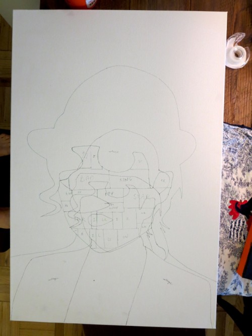
The composition changed in the first review… here is the ‘collage map’ of MJ’s face.
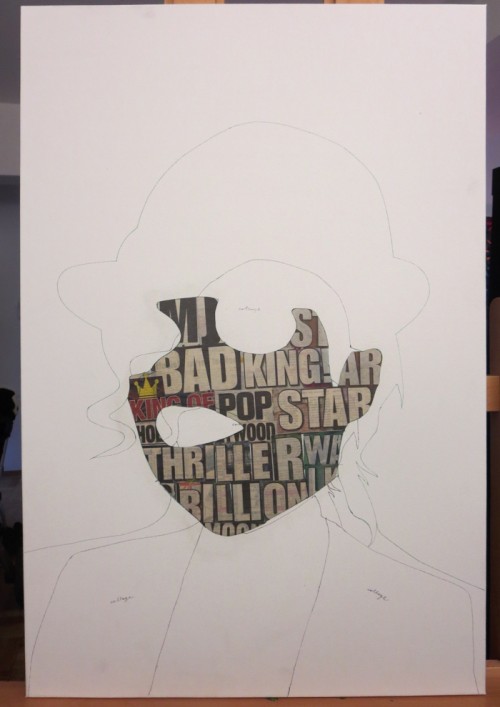
The headlines are culled from the New York Post — MJ, King of Pop, Bad, King, Star, Thriller, Moon Walk, Billions…
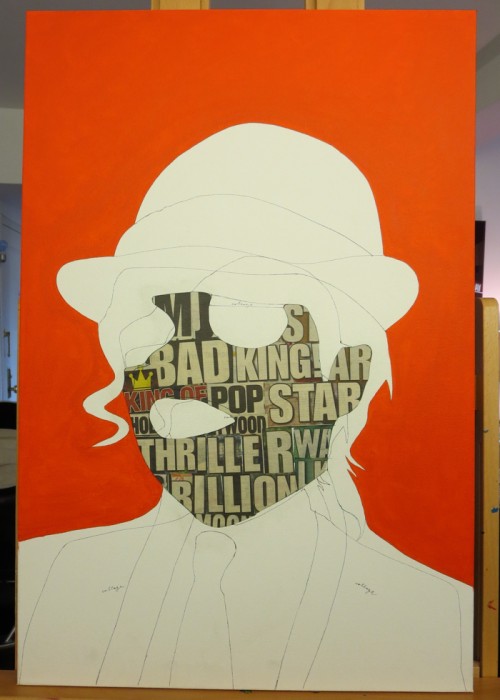
Headlines down, image drawn, it’s time for a cadmium orange background.
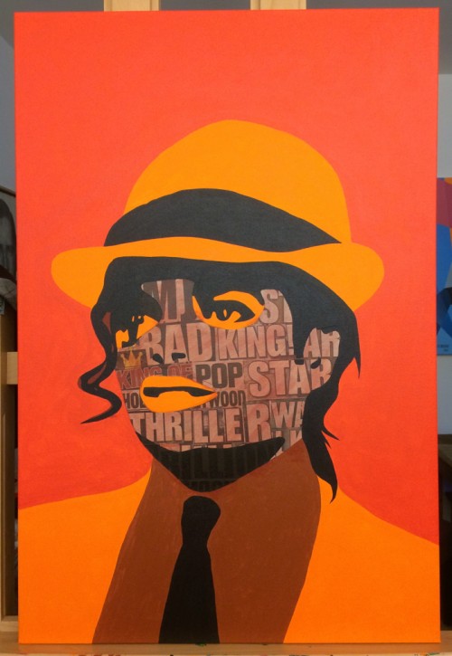
Here’s where the painting begins to enter it’s teen years, or in other words, the ugly phase. I’ve cultivated this process over 4 years, and each subject must endure braces.
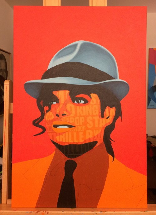
The source image was a photograph I took of a paused scene in Smooth Criminal. I then flipped the image horizontally, stretched MJ out a smidge, reshaped his hat into something I would wear, stylized the hair, and made some wardrobe modifications. Here, you’ll see, I went fedora first. Lead with the head, the rest will follow.
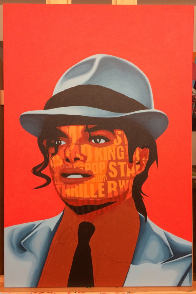
Jacket painted, and beginning to carve into the face. It’s a delicate balance between legibility and likeness.
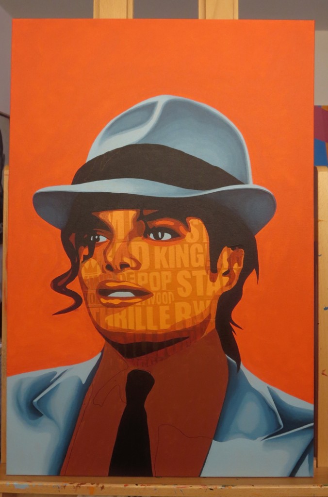
Here it’s all beginning to make more sense… but the tones aren’t where I’d like them to be.
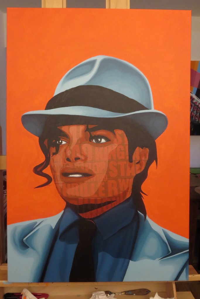
So I painted the shirt to gauge how the entire painting should feel, and went back into the face with darker tones to build another ground.
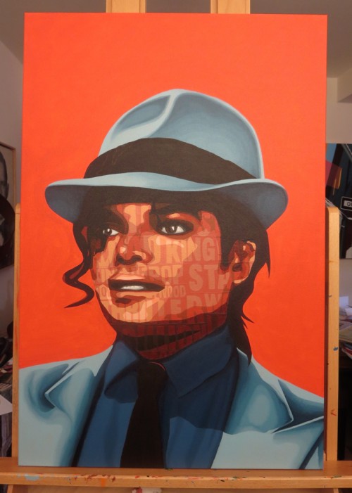
Now it feels right… so, time to add the lighter tones…
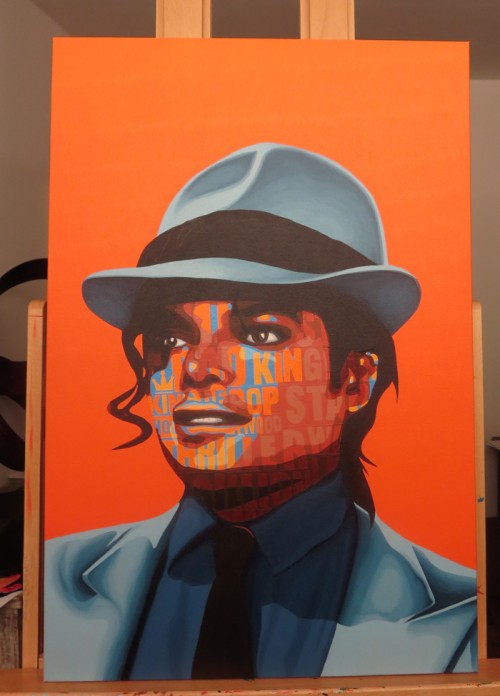
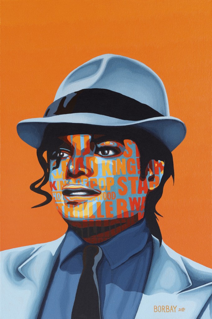
The King of Pop. Michael Jackson. I watched every one of his music videos in preparation for this project, and what I realized was this: he was so much a part of my formative years, I could scarcely believe it. His presence… brand… impact… business acumen — has always felt electric. So I went for this palette. Bright. Complementary. A beloved man enshrouded in controversy — on fire.
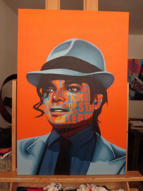
Here is where it all came together. Bright orange. Bright yellow. Pure red. A slight background gradient.

And there he was, just prior to signature… the painting positively glows in the dark (for real).

I give you — Michael Jackson. You’ll notice the difference in the final image and the working drafts… this was professionally photographed. I work under natural florescent light in the studio, but they tend to throw a darker/warmer spectrum — so the leap to the final always reveals a great deal.

And, again, the book cover. Thank you to Anna Dorfman and the entire Simon & Schuster/Atria team for your help, guidance and collaboration. I want to thank Zack O’Malley Greenburg, an artist I deeply admire, for choosing me to put the face on his brilliant words. Being a part of this project means the world… the book is outstanding, and with this type of early buzz, I can only imagine how many people will own this tome:


8 comments
Comments are closed.