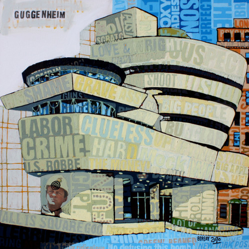
At this point, I am just going to say it – I like the Guggenheim. Following my recent paintings of the Apple Store, Museum of Art and Design and First Avenue – Minneapolis, I decided to take my New York Post collage work to Frank Lloyd Wright‘s masterpiece.
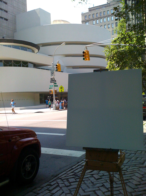
About 20% of the people who actually go into the Guggenheim stop by to look at my painting. For all intent and purpose, I am only about 150 feet away and ten years (or less) from a sizable pay grade increase.
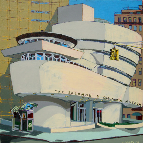
The original Guggenheim painting (above) was sold to a collector in Milan.
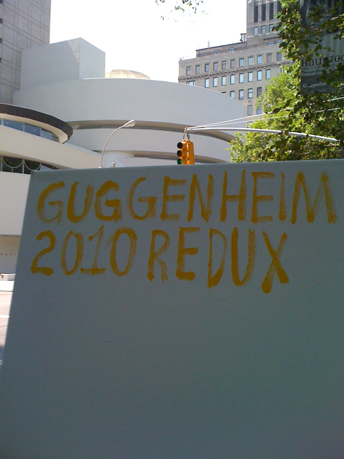
Redux! Taking a movie title sensibility to my work is the new payne’s grey. Guggenheim Now; Return of the Guggenheim; The Guggenheim Part II; The Guggenheim Part III (which ruins the series, due to poor acting.)
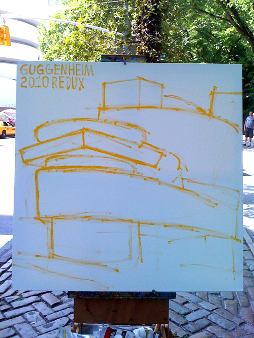
Getting started with an outline. The Gugg can feel like a spaceship, toilet, and, as I overheard on the street, a “parking garage.”
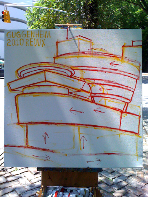
Getting red, nailing down the directional collage flow. At this juncture, people easily understand what I am up to.
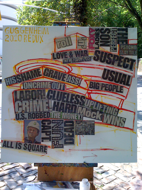
As soon as the collage gets involved, people begin to scratch their head and mumble, “wtf is up with this guy? Is he daft? Deranged? Dumb? Depressed?”
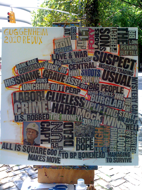
Here, I had a gentleman approach me with some questions. Here is our conversation:
Him: “Yo, who did dis.”
Me: “The painting or the building?”
Him: “Building.”
Me: “It was architected by Frank Lloyd Wright.”
Him: “Word. Word. So yo. Why you hatin’ on Frank Lloyd Wright?”
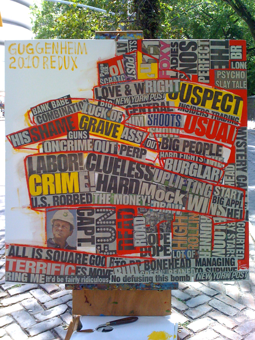
I suppose the heavy headlines coupled with some cadmium red medium can spell anger, or hate-ification. However, I like to envision a newspaper blowing down on the ground with paint splattered on top of it. Is it that random? Isn’t it?
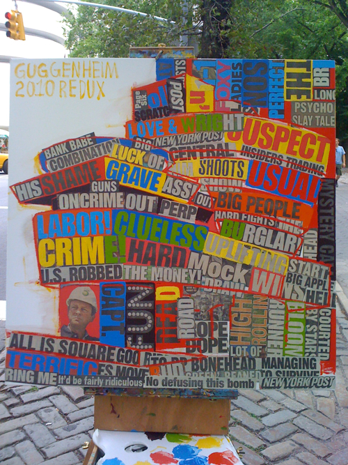
Splashing blues and greens to start out day two.
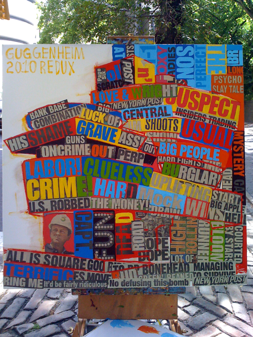
Splashing a blue-filled sky. When you apply a heavily whitened blue, and place it next to an orange, the result is electric avenue.
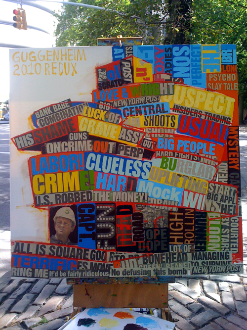
Hacking into the scene with a nice, dark purple.
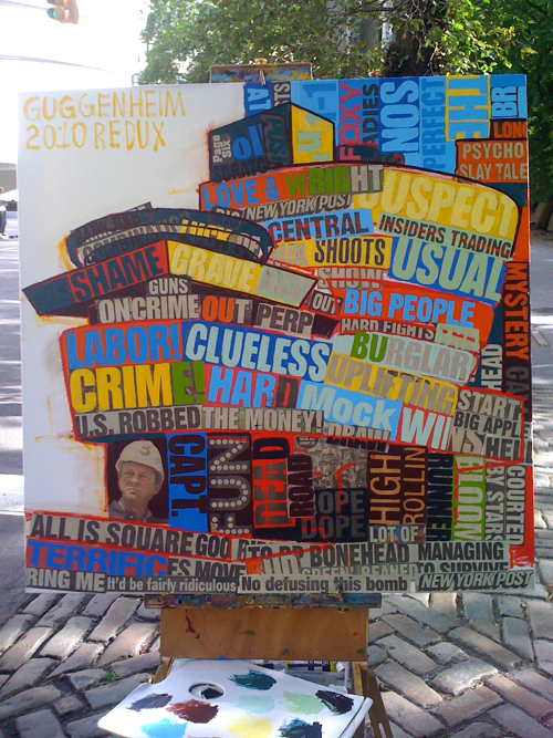
Beginning the outline parade, starting with the rotunda turret portion of the museum. Little known fact: critics often step out on this balcony to commemorate the art they dislike by carving the title and “street critic name” into the Southern wall. A critics street name is created the same way a porn star name is (first pet name + home street); only, it’s (fave art movement + fave sex position) – an example? De Stijl Reverse Cowgirl, which would be shortened to DeStijl R. Cowgirl.
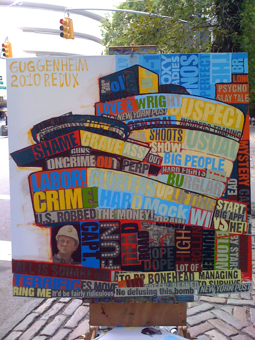
Beginning to paint the light with a delicate, yet intrusive bright yellow.
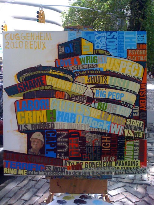
Light versus dark. He-Man versus Skeletor. Bill versus Hillary. It’s all about the clash, followed by resolve.
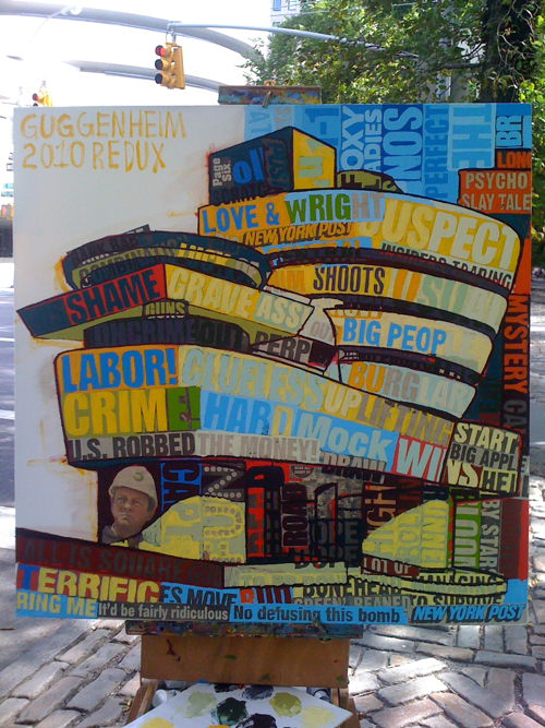
Splashing in a sense of light on the bottom of the building, which, at this point, is more confusing than the success of Desperate Housewives.
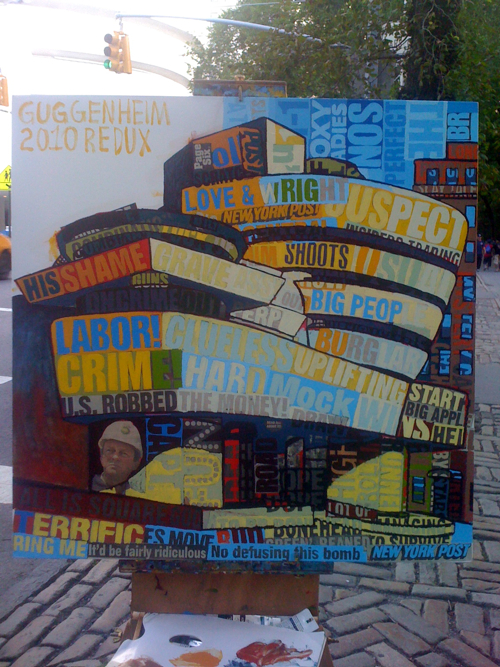
It was a dark and stormy shadow… this instantly rubbed me the wrong way. I made a mistake.
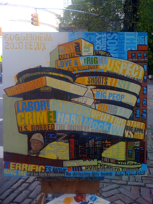
Ah, a nice, melted olive to solve this problem… for now. Also, the building in the background is getting the fix… which, FYI, also severed as a B-Roll shot for Paul Allen’s apartment in American Psycho. By-the-by, somebody in that movie required some serious meds.
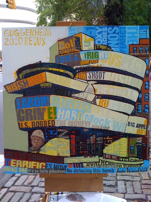
Sharpening the conch spiral of the Wrightsterpiece.
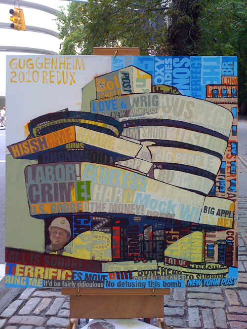
Baking some light into the luxury apartments in the background, continuing the de-colorification of the Guggenheim.
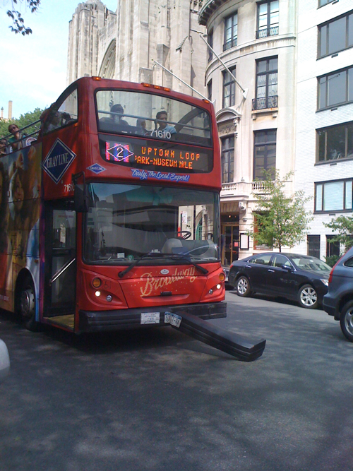
A tour bus had an ouchie about ten feet from my easel during my last session. Interesting, was the universe telling me something?
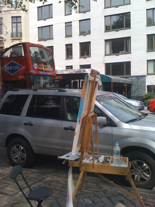
Close! Oh, check my new collapsible stool, with a back. With a back!
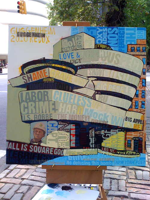
OK, hacking into the foreground, finally. It is important when you get to a point of near completion on a large portion of the canvas that the entire image is brought up to the same level. It’s like picking matching blinds for house and garage, the latter of which is only a foundation. Horse before the cart. Catch the grounder before you throw it to first. Cliché’s all day.
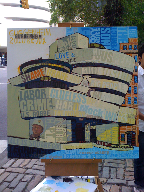
Now, feeling pretty balanced.
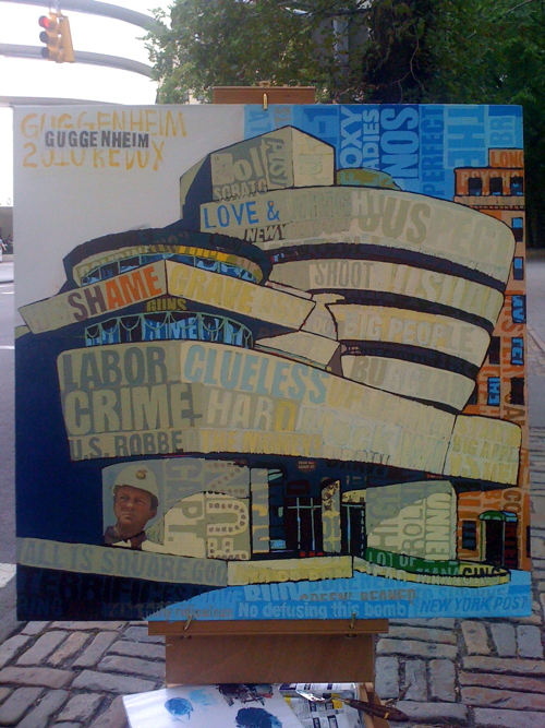
Dropping a dark blue shadow behind the Guggenheim, yet, another mis-step. It makes BP CEO Tony Howard seem even more sinister than his reputation. As with the other paintings in this series, Mr. Howard is the targeted man… only, his technical flaw far exceeds a faulty iPhone 4.
Fin! I resolved the shadow wall with a rich orange, which was then covered in the pattern of the actual wall behind it. I selected the type to actually collage G-U-G-G-E-N-H-E-I-M in the top left of the canvas. Tony is targeted. The museum is fun, clueless, grave and full of big people.
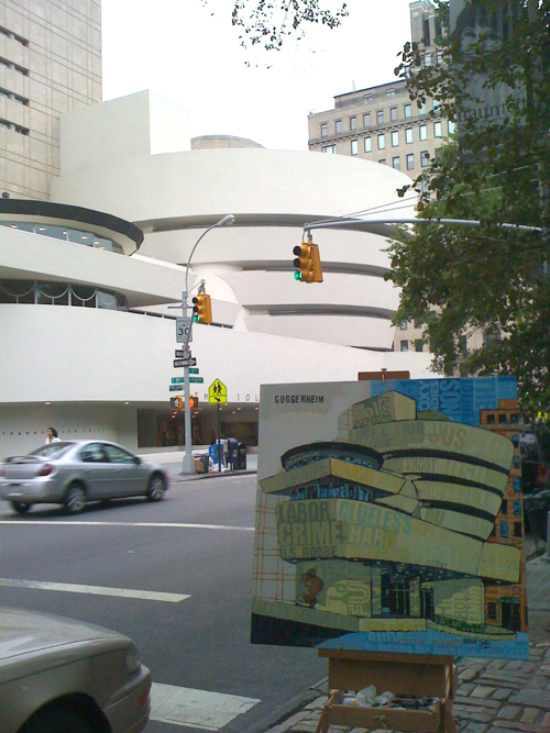
Art lives in context. Soon, this art will live in someone’s living room. One day, it will hang in the Guggenheim. Bold? Sure. But why live light. I am about Heinz 57, you can take that Hunt’s and shove it.
Great Post! Love the commentary 🙂
Love how you described the Redux as more verbose. Except for the Void on the upper left of the canvas, which I guess would be considered quite laconic. Great process summary Borbay!
I love this Redux version, it’s got more heart.
Love the process! .. and the result
Cool series!